10 Living Room Design Mistakes That Quietly Destroy Your Space (And How to Fix Them Like an Architect)

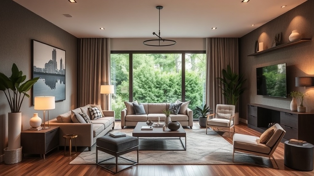
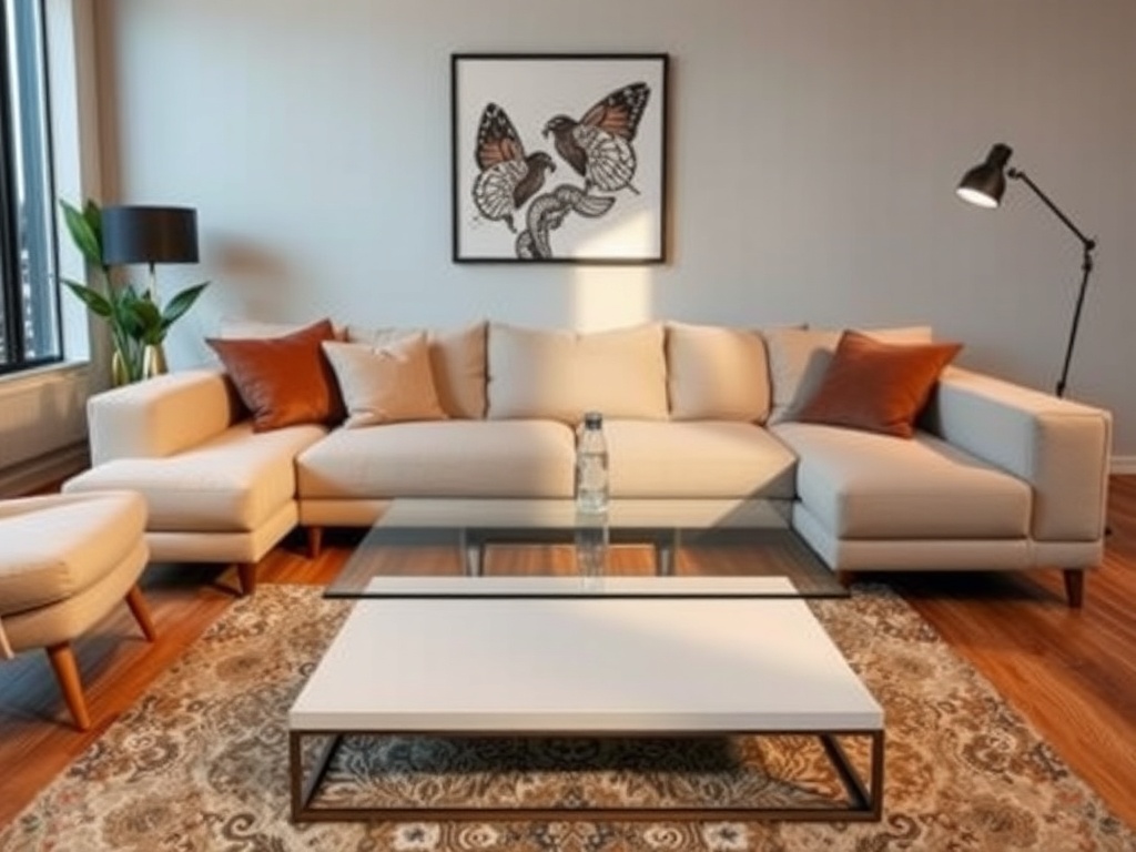
The Rug That’s Floating Like an Island
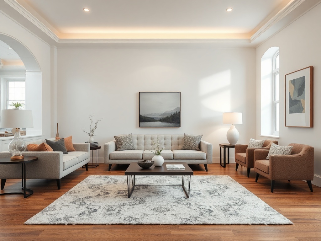
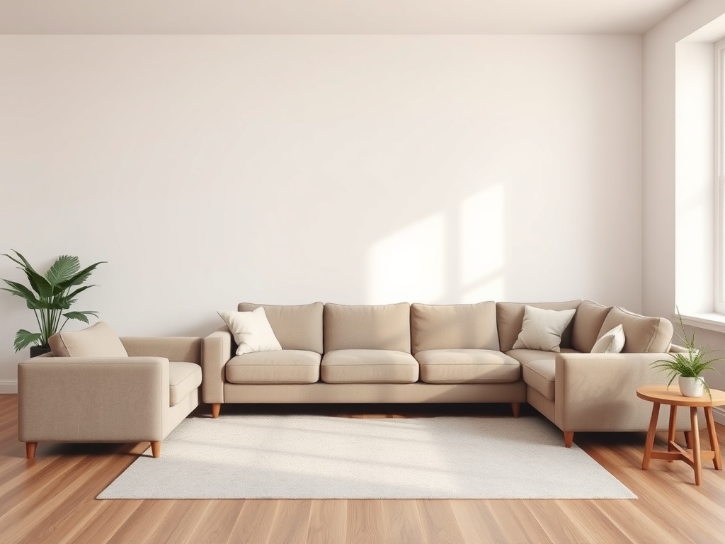
The "Matching Set" Catastrophe
Lighting That’s Doing the Bare Minimum
The Coffee Table That’s the Wrong Scale
Walls That Are Afraid of Commitment
The Sofa Pushed Against the Wall
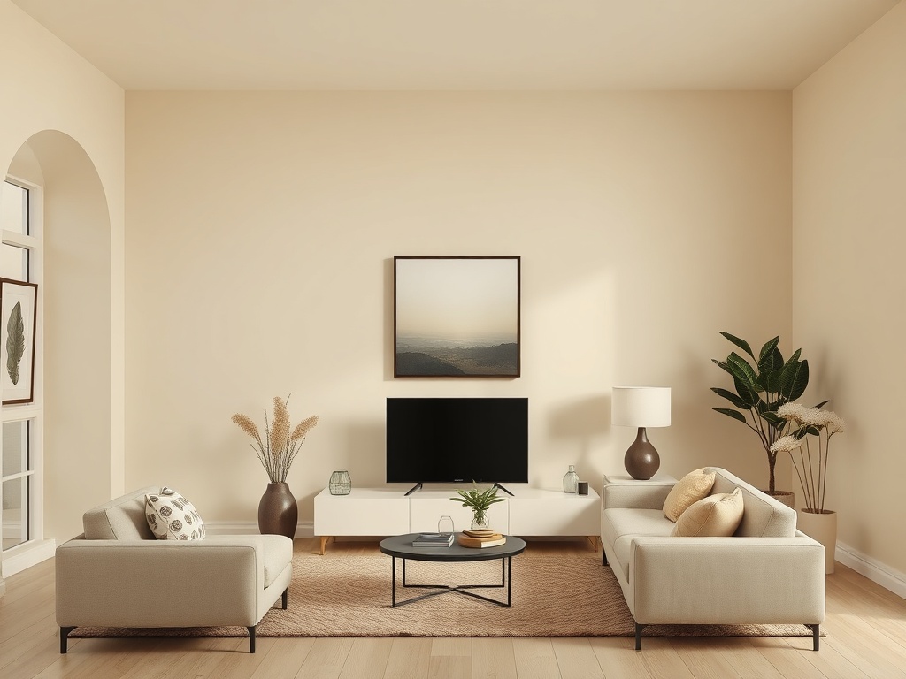
The "Sad Beige" Color Trap
Ignoring the Fifth Wall
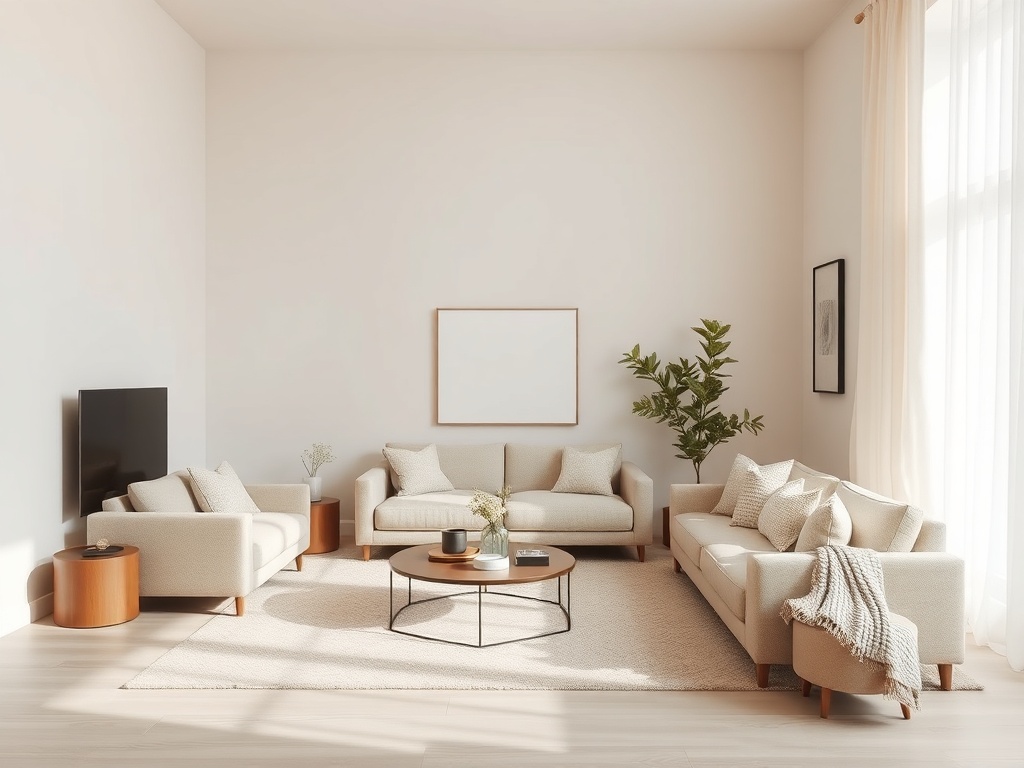
Art Hung Like It’s Trying to Escape
No Material Hierarchy
Let’s look under the hood of your living room—the space that should feel like a controlled composition but often ends up reading like a furniture showroom clearance bin. Most "bad" rooms aren’t failing because of budget. They’re failing because of proportion, material tension, and a complete misunderstanding of how objects relate to each other in space.
This is not about trends. This is about anatomy. Fix these ten mistakes, and your room will stop whispering "something’s off" every time you walk in.
1. The Rug That’s Floating Like an Island
The most common failure I see: a rug that’s undersized, sitting timidly under a coffee table like it’s afraid of commitment.
The math: your rug should anchor at least the front legs of all major seating pieces. Ideally, all legs. (Yes, even in small rooms.)
The fix: Size up. A 9x12 is the baseline for most standard living rooms—not a luxury.
Splurge vs. Save: Splurge on a high-density wool rug (300–500 GSM minimum). Save on side tables.
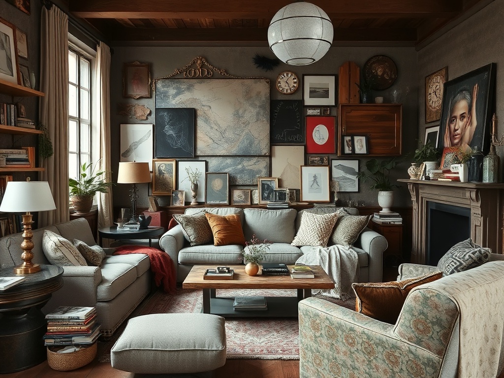
2. The "Matching Set" Catastrophe
If your sofa, loveseat, and coffee table came from the same catalog page, you’ve flattened your space into visual monotony.
Rooms need tension. Contrast. A conversation between pieces—not a chorus singing in unison.
The fix: Break the set. Introduce one vintage piece or a material shift (wood vs. metal vs. textile).
Technical aside: Contrast creates depth perception. Without it, your room reads as a single plane.
3. Lighting That’s Doing the Bare Minimum
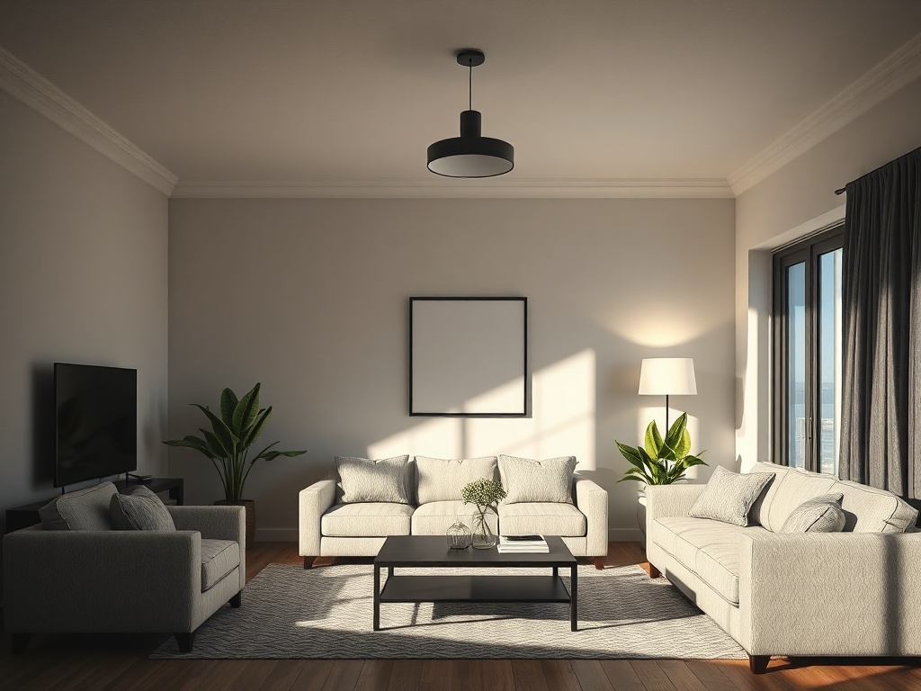
One overhead fixture is not "lighting." It’s interrogation.
The anatomy of proper lighting:
- Ambient (overall illumination)
- Task (reading, working)
- Accent (highlighting texture or art)
The fix: Minimum three light sources per room. And for the love of structural integrity—no integrated LEDs.
4. The Coffee Table That’s the Wrong Scale
Your coffee table should be two-thirds the length of your sofa. Not half. Not "whatever was on sale."
Height rule: Within 1–2 inches of your seat height.
Why it matters: Scale is what makes a room feel intentional. Get this wrong, and everything else collapses.
5. Walls That Are Afraid of Commitment
Blank walls are not minimalism. They’re indecision.
The fix: Anchor at least one wall with a large-scale artwork or gallery arrangement. (Proportion: art should span 60–75% of the furniture width beneath it.)
Material note: Mix frames—don’t default to identical black rectangles unless you enjoy visual boredom.
6. The Sofa Pushed Against the Wall (Out of Fear)
Unless you’re working with a truly microscopic footprint, pulling furniture away from walls creates breathing room—and better circulation.
The fix: Float the sofa even 4–6 inches forward. Add a console behind it if needed.
Result: Instant architectural intention.
7. The "Sad Beige" Color Trap
A fully neutral palette without variation is the visual equivalent of white noise.
The fix: Introduce contrast through texture first, color second. Think boucle against leather, linen against wood.
Technical aside: Texture variation creates shadow play—your brain reads it as depth.
8. Ignoring the Fifth Wall (Your Ceiling)
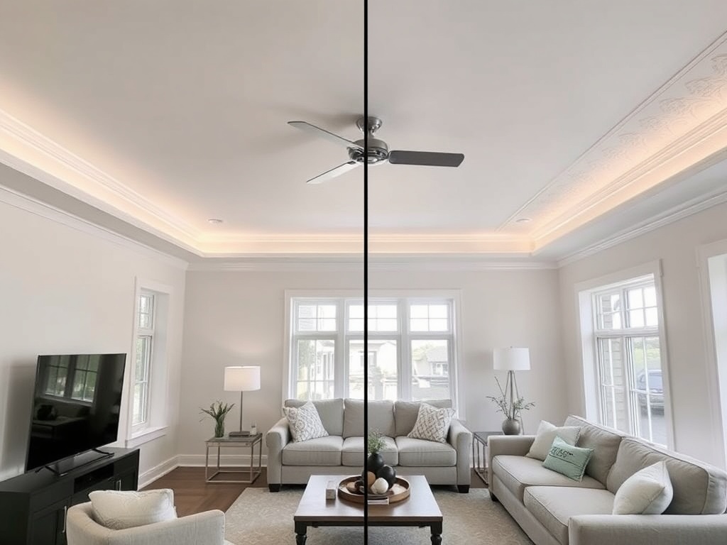
The ceiling is not a default setting. It’s your fifth wall—and most people leave it unfinished.
The fix: Paint it, add beams, or introduce subtle tonal variation.
Result: Vertical dimension. Your room suddenly feels taller and more considered.
9. Art Hung Like It’s Trying to Escape
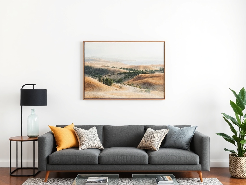
If your artwork is floating near the ceiling, it’s disconnected from the furniture below.
The rule: Center of art should sit at ~57–60 inches from the floor—or 6–8 inches above furniture.
Why: You’re aligning with human eye level, not architectural guesswork.
10. No Material Hierarchy (Everything Screaming at Once)
If every piece is trying to be the star, nothing is.
The fix: Establish a hierarchy:
- Primary material (sofa or rug)
- Secondary (tables, chairs)
- Accent (decor, lighting)
Think like an architect: Structure first, decoration second.
The Takeaway: Design Is a System, Not a Shopping List
You don’t fix a room by buying more things. You fix it by understanding how the existing elements interact—scale, light, texture, and proportion.
Most of these mistakes aren’t expensive to correct. They’re conceptual errors. And once you see them, you can’t unsee them.