How to Design a Living Room That Actually Works (Scale, Flow, and the High-Low Mix Explained)

Let’s look under the hood of your living room—the most over-furnished, under-thought space in the average home. If your room feels "off," it’s rarely because you picked the wrong sofa color. It’s because the underlying geometry, scale, and circulation (how humans actually move through the space) are fighting each other.
This is not about copying a catalog. This is about understanding the anatomy of a room so you can solve it—once—and stop second-guessing every purchase.
Step 1: Establish the Real Focal Point (Not the One Instagram Told You)
Every room needs hierarchy. That’s not a design preference; it’s a cognitive requirement. Your eye needs somewhere to land first, or the room reads as noise.
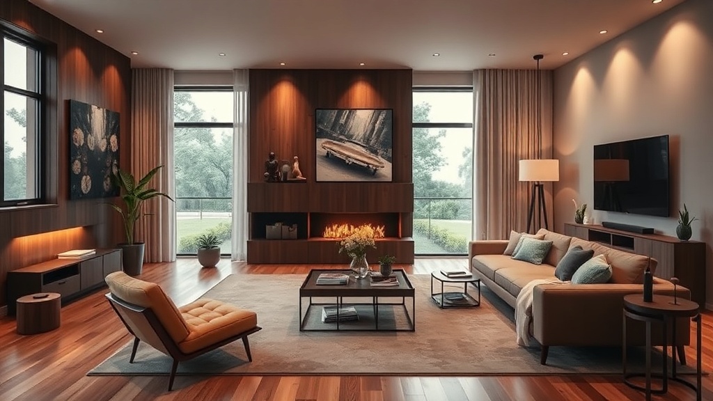
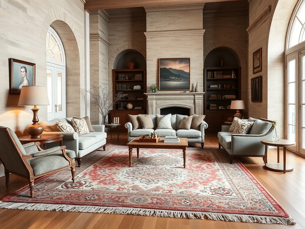
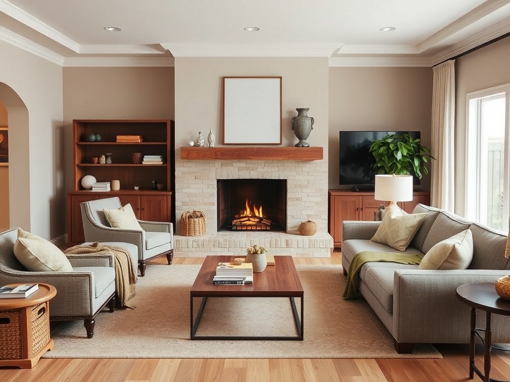
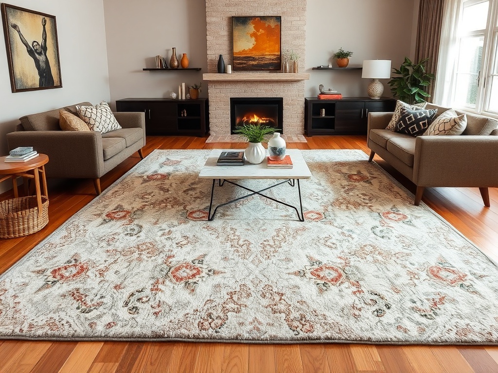
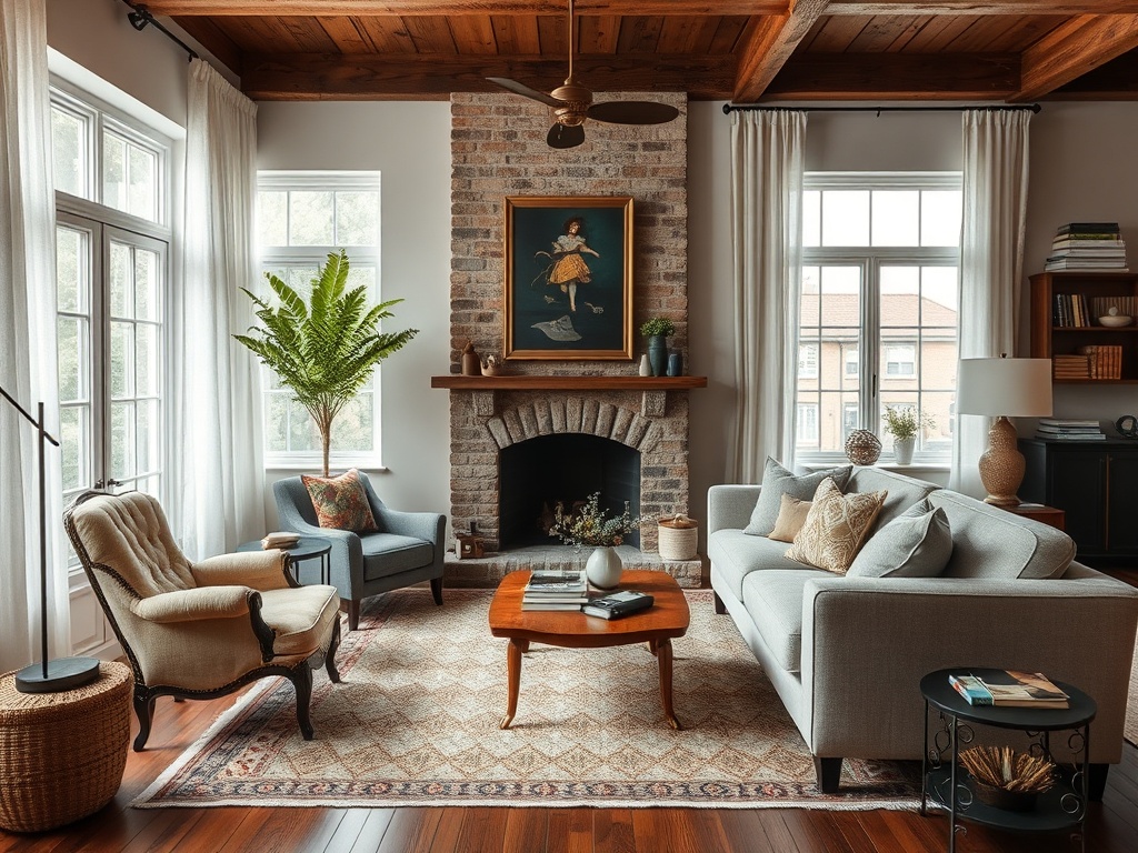
In most living rooms, the focal point is one of three things: a fireplace, a large window (fenestration, for the nerds in the back), or a media wall. The mistake? Treating all three like they deserve equal attention. They don’t.
The rule: pick one dominant focal point, then let everything else support it.
- Splurge: Invest in the focal point—this could mean proper millwork around a fireplace or a well-scaled media console.
- Save: Secondary elements (side tables, decorative objects) should not compete for attention.
If your room has no natural focal point, you create one—usually with scale (an oversized artwork or a properly proportioned rug).
Step 2: Solve the Rug Equation (This Is Where Most Rooms Collapse)
If your rug is too small, the entire room shrinks with it. This is not subjective—it’s visual math.
The correct rule: at least the front legs of every major seating piece must sit on the rug. Ideally, all legs do.
For a standard sofa setup, that typically means:
- 8x10 minimum for small rooms
- 9x12 for most living rooms
- 10x14 if you have the square footage
And let’s talk material. A 200 GSM rug (grams per square meter) is decorative. A 400+ GSM rug is structural—it anchors the room both visually and physically.
High-value sourcing tip: Vintage rugs outperform most mid-market options because their density and natural wear create patina you can’t fake.
Step 3: Fix Your Furniture Layout (Stop Pushing Everything Against the Walls)
The "perimeter hug" is a rookie mistake. Furniture should define space, not apologize for it.
Pull your sofa off the wall—even 6–12 inches makes a difference. This creates breathing room and allows for circulation behind the seating area.
Think in zones:
- Conversation zone (sofa + chairs)
- Circulation paths (at least 30–36 inches clearance)
- Secondary function (reading nook, desk, etc.)
If people have to sidestep like they’re in a crowded elevator, your layout is failing.
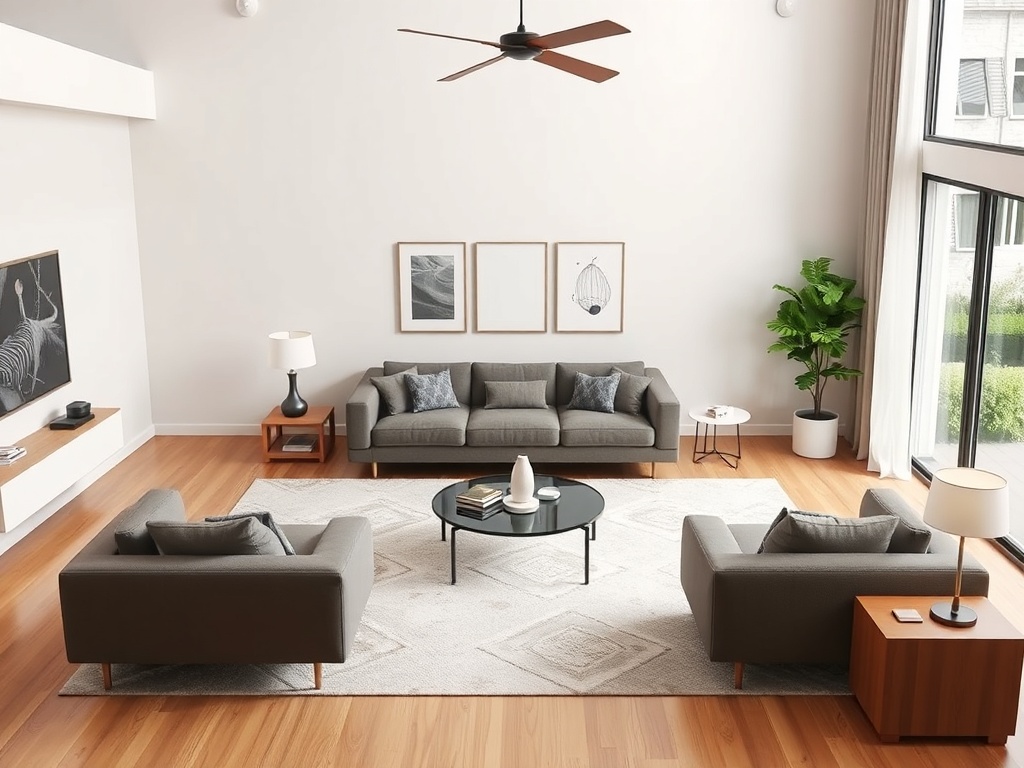
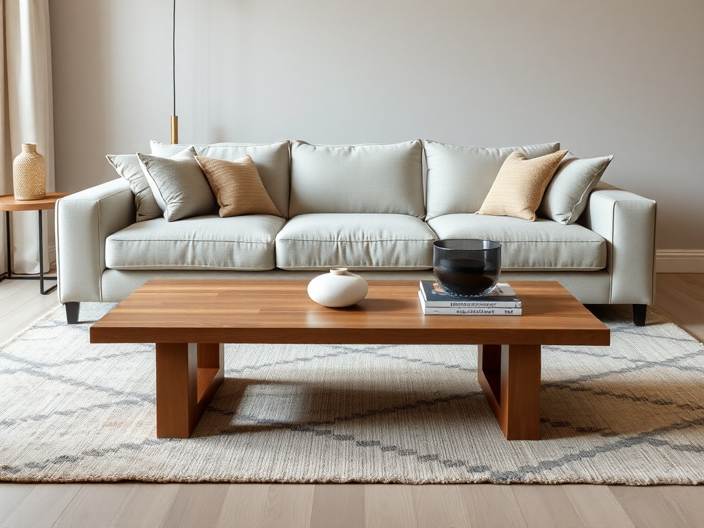
Step 4: Get the Scale Right (Your Coffee Table Is Probably Wrong)
Let’s talk proportions. Most coffee tables are either too small (lost in the room) or too large (blocking movement).
The formula:
- Length: about 2/3 the length of your sofa
- Height: within 1–2 inches of your seat height
- Clearance: 16–18 inches between sofa and table
This is where architectural thinking matters. You’re not just placing objects—you’re calibrating relationships between them.
Splurge vs. Save:
- Splurge: A solid wood or stone coffee table (this is a tactile anchor)
- Save: Side tables can be lighter, more flexible pieces
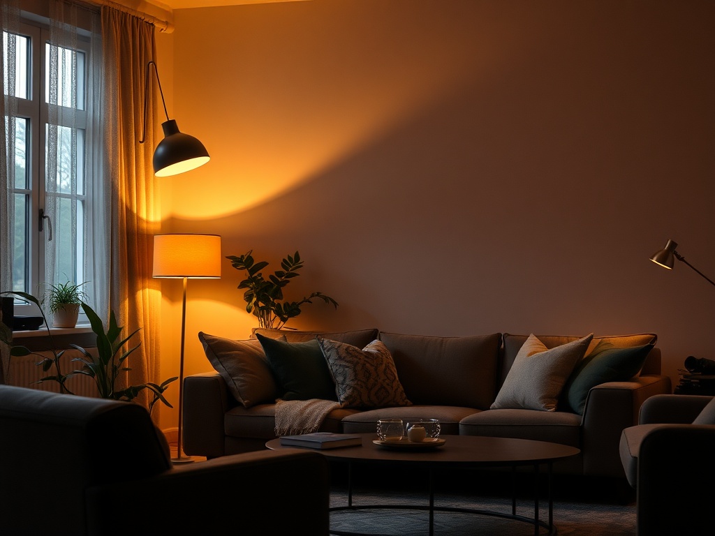
Step 5: Layer Lighting Like an Adult (Overhead Is Not Enough)
If your entire room relies on one ceiling fixture, you’ve built a waiting room.
You need three layers of light:
- Ambient: General illumination (ceiling fixture—but make it replaceable bulbs only)
- Task: Reading lamps, floor lamps
- Accent: Table lamps, sconces for mood
And please—no integrated LEDs. If the bulb dies, the fixture becomes landfill.
Kelvin matters: 2700K–3000K is the range that makes humans look like humans, not hospital patients.
Step 6: Introduce Contrast (This Is What Gives a Room a Pulse)
A room without contrast is a room without tension—and tension is what makes spaces interesting.
If everything is the same tone, material, or era, the room reads flat. You need friction.
- Mix materials: wood + metal + textile
- Mix eras: vintage + contemporary
- Mix tones: light + dark
This is the high-low mix in action. A $40 vintage textile can elevate a $2,000 sofa more effectively than another expensive object.
Step 7: Address the Fifth Wall (Your Ceiling Is Not Invisible)
The ceiling is the most ignored surface in the room—and the fastest way to add architectural depth.
Even a subtle move (a warmer white, a soft tint, or simple molding) creates contrast and frames the space.
Flat white ceilings are the default, not the solution.
Step 8: Edit Ruthlessly (More Furniture Is Not the Answer)
If your room feels crowded, the solution is subtraction, not addition.
Every piece should earn its place—functionally or aesthetically. If it does neither, it’s visual noise.
This is where most people struggle. They keep adding instead of refining.
The test: remove one piece. If the room improves, it shouldn’t come back.
Final Thoughts: Design Is a System, Not a Shopping List
A well-designed living room isn’t about finding the "right" sofa or the "perfect" coffee table. It’s about understanding how scale, proportion, light, and material interact.
Once you understand the system, you stop guessing. You start designing.
Steps
- 1
Establish the real focal point
- 2
Solve the rug equation
- 3
Fix your furniture layout
- 4
Get the scale right
- 5
Layer lighting properly
- 6
Introduce contrast
- 7
Address the ceiling
- 8
Edit ruthlessly