How to Design a Living Room That Actually Works (Scale, Layout, and the High-Low Mix Explained)

Let’s look under the hood of your living room—the space that somehow manages to feel both overcrowded and underdesigned at the same time. This isn’t a personality flaw. It’s a geometry problem.
The reason most living rooms feel “off” has nothing to do with taste and everything to do with scale, proportion, and sourcing decisions that ignore how a room actually functions. We’re going to fix that, step by step, with architectural precision and zero fluff.
Step 1: Diagnose the Room (Before You Buy Anything)
You do not start with a sofa. You start with a measurement.
Pull out a tape measure (yes, a real one—digital ones are liars at scale). You need three numbers:
- Room length
- Room width
- Ceiling height (the forgotten third dimension)
This is your spatial envelope. Everything you bring into the room either respects this envelope or fights it.
The most common failure I see? A 5x7 rug floating in a room that mathematically requires a 9x12. That’s not a styling issue—that’s a proportion error.

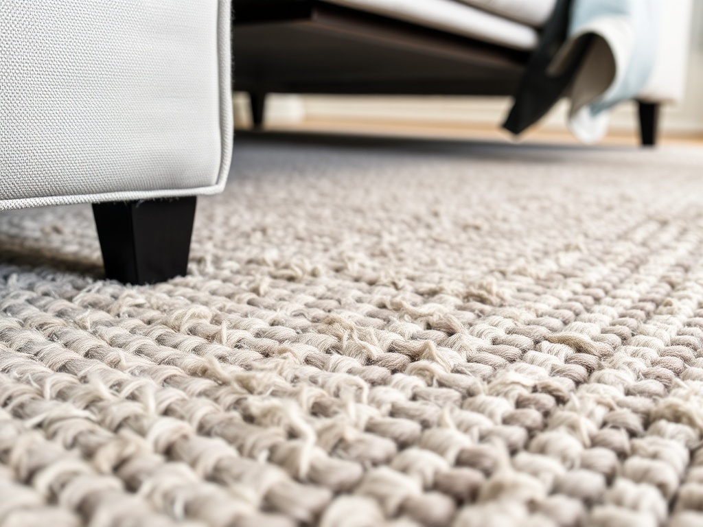
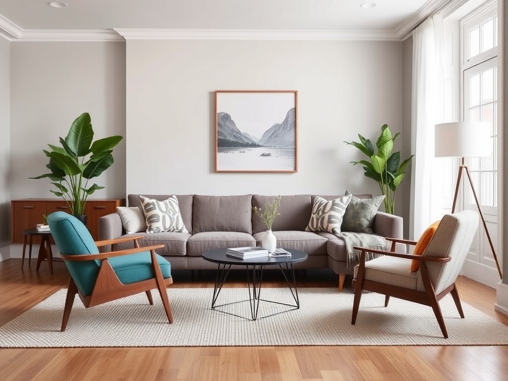
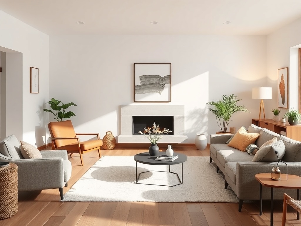
Step 2: Anchor the Room with the Right Rug (The Real Foundation)
Rugs are not accessories. They are structural.
Think of the rug as the foundation slab of your living room. It defines the footprint of your seating zone and dictates how everything else relates spatially.
The Rule: Bigger than you think.
- Small rooms: typically 8x10 minimum
- Standard living rooms: 9x12 or larger
- Open concepts: 10x14 and up
Material matters too. Look for wool or wool blends (400–800 GSM is your sweet spot for durability and comfort). Synthetic rugs flatten over time and lose their dignity—much like fast furniture.
Splurge vs. Save:
- Splurge: Vintage wool rug (it anchors everything and ages well)
- Save: Secondary textiles like throw pillows
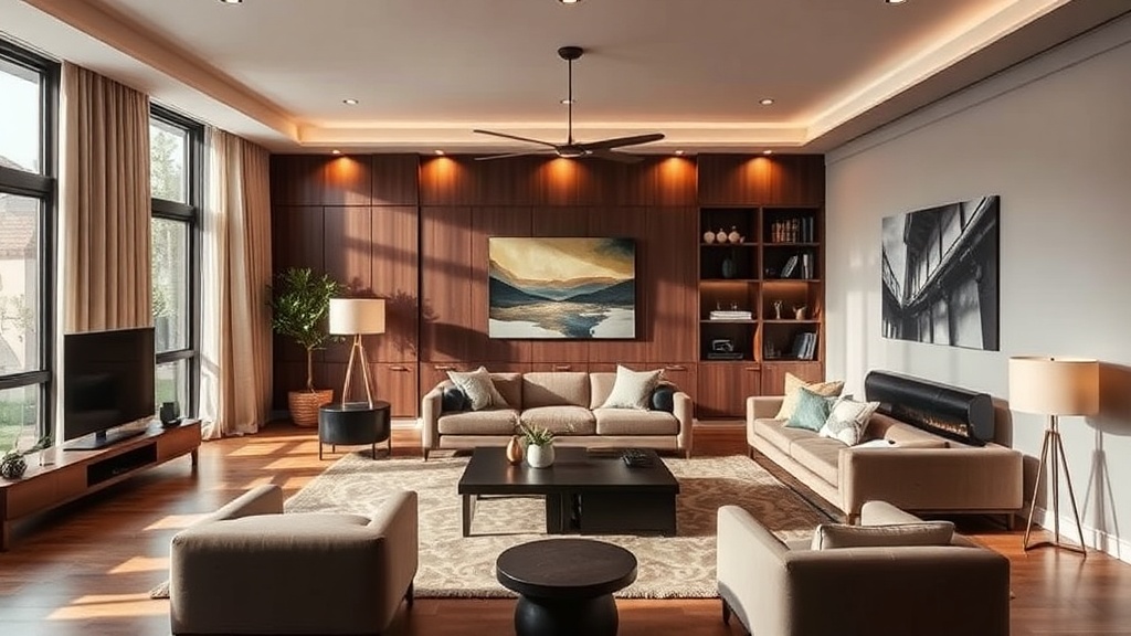
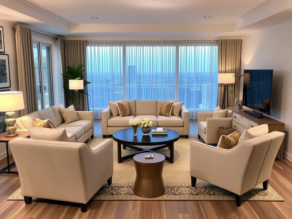
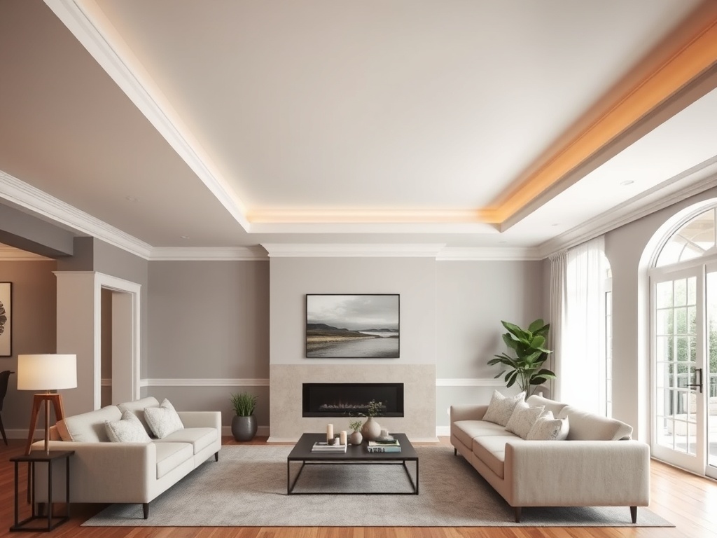
Step 3: Establish the Layout (Stop Pushing Furniture Against Walls)
If your furniture is lined up like it’s waiting for a bus, we need to talk.
Walls are not magnets. Pull your furniture inward to create a defined conversation zone. The goal is spatial intimacy, not perimeter defense.
Core layout principles:
- Maintain 16–18 inches between coffee table and seating (leg clearance matters)
- Keep pathways at least 30–36 inches wide
- Center the layout around a focal point (fireplace, window, or even a well-placed artwork)
This is where most rooms either click or collapse. The geometry needs to support human behavior—how you sit, move, and interact.
Step 4: Choose a Sofa That Matches the Room’s Scale
The sofa is not the star. It’s the anchor.
Here’s where people overshoot: buying a massive sectional for a modest room or, worse, a too-small sofa that floats awkwardly in space.
What actually matters:
- Seat depth (21–24 inches is standard comfort range)
- Overall length relative to wall span
- Leg visibility (exposed legs create visual lightness)
If your room is tight, avoid bulky arms and low-slung profiles that eat visual space.
Splurge vs. Save:
- Splurge: Sofa frame and upholstery quality (kiln-dried hardwood, high-density foam)
- Save: Side chairs (vintage sourcing wins here)
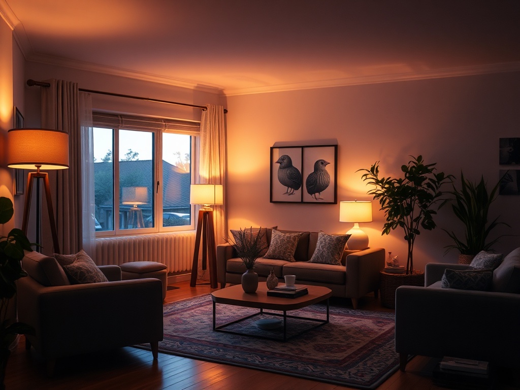
Step 5: Layer Lighting Like an Architect (Not a Big Box Store)
Overhead lighting alone is the fastest way to flatten a room.
You need layers:
- Ambient (general illumination)
- Task (reading lamps, directional light)
- Accent (highlighting art or textures)
And for the love of all things structural: avoid integrated LEDs. If you can’t change the bulb, you’re buying a future landfill contribution.
Target 2700K–3000K color temperature for warmth that doesn’t feel like a hospital corridor.
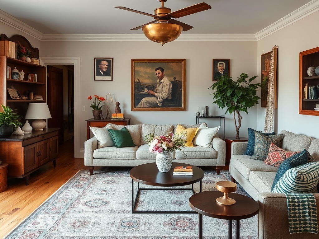
Step 6: Introduce the High-Low Mix (Where the Soul Lives)
This is where the room stops looking like a catalog and starts looking like you.
The high-low mix is not a trend—it’s a strategy:
- Pair a well-made sofa with a $50 vintage textile
- Combine unlacquered brass hardware with a mass-market console
- Use one statement piece to elevate everything around it
The tension between elements is what creates interest. Too much “matching” kills the room.
Step 7: Address the Fifth Wall (Your Ceiling Is Not Innocent)
Plain white ceilings are a missed opportunity. Full stop.
You don’t need anything dramatic—sometimes a subtle tone shift or a matte finish is enough to create depth. But ignoring the ceiling entirely flattens the room’s vertical dimension.
This is especially critical in rooms with lower ceilings, where visual layering matters even more.
Step 8: Edit Ruthlessly (Not Everything Deserves to Stay)
Design is as much about subtraction as it is about addition.
If something doesn’t serve the room—functionally or visually—it goes. This includes:
- Undersized rugs
- Overcrowded side tables
- Decor with no material integrity
A well-designed room has breathing space. Negative space isn’t empty—it’s intentional.
The Anatomy of a Living Room That Works
When you get this right, the room feels effortless. But what’s actually happening is a series of precise decisions:
- Correct scale (rug, sofa, layout)
- Layered lighting
- Material contrast
- A disciplined high-low mix
This is not about copying a look. It’s about understanding the system behind it.
Design isn’t magic. It’s math, material, and a little bit of restraint.
Steps
- 1
Diagnose the Room with Measurements
- 2
Anchor the Room with a Properly Sized Rug
- 3
Establish a Functional Furniture Layout
- 4
Choose a Sofa That Fits the Scale
- 5
Layer Lighting for Depth
- 6
Introduce a High-Low Mix
- 7
Address the Ceiling as the Fifth Wall
- 8
Edit and Refine the Space