How to Fix a Living Room That Feels "Off" (The Architectural Breakdown You Actually Need)

Let’s look under the hood of your living room—the one that technically has all the right pieces, but somehow feels like it was assembled by a committee that never met. This isn’t about buying more things. It’s about diagnosing the structural imbalances that are quietly sabotaging the space.
Most rooms don’t fail because of budget. They fail because of proportion, hierarchy, and material tension (or lack thereof). We’re going to fix that—step by step—with the same logic an architect uses to make a space feel inevitable rather than accidental.
Step 1: Diagnose the Scale Problem (It’s Usually the Rug)
If your room feels disconnected, I’m willing to bet your rug is undersized. A rug is not a decorative accessory—it’s the foundation plane that organizes the entire seating arrangement.
The rule: at minimum, the front legs of all major seating pieces must sit on the rug. Ideally, everything sits fully on it. A floating coffee table island in the middle of hardwood? That’s visual chaos.
(Technical aside: A proper living room rug is typically 9x12 or larger for most standard layouts. Anything smaller creates what I call “high-water pants energy.”)
The Save: Vintage wool rugs. Higher pile (300–600 GSM) gives you texture and durability without showroom pricing.
The Splurge: Custom-cut natural fiber rugs with bound edges—especially for awkward layouts.
Step 2: Establish a Clear Furniture Hierarchy
Not all furniture deserves equal visual weight. When everything screams for attention, nothing is heard.
You need a dominant element (usually the sofa), secondary players (chairs), and supporting actors (side tables, lighting). If your accent chairs are louder than your sofa, you’ve inverted the hierarchy.
Look for contrast in silhouette and material. A low-profile modular sofa paired with delicate spindle-leg chairs creates tension. Two bulky pieces fighting for dominance? That’s a stalemate.
(For the nerds: this is about visual mass distribution, not just size.)
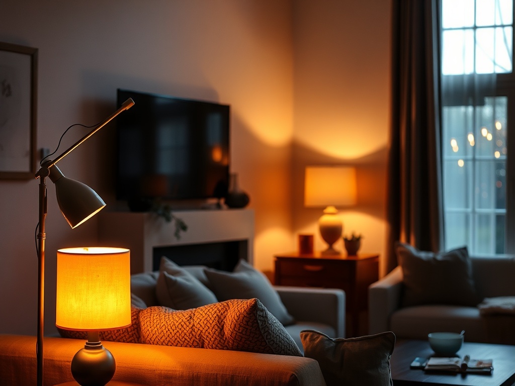
Step 3: Fix Your Lighting (No, Overhead Isn’t Enough)
If your entire room is relying on a single ceiling fixture, we need to talk. Lighting should operate in layers: ambient, task, and accent.
At minimum, you need three distinct light sources at varying heights. Floor lamp, table lamp, maybe a wall sconce. This creates depth and eliminates that flat, interrogation-room feel.
And for the love of structural integrity: avoid integrated LEDs. If the bulb can’t be changed, the fixture is disposable.
(Target: 2700K for living rooms—warm, not jaundiced.)
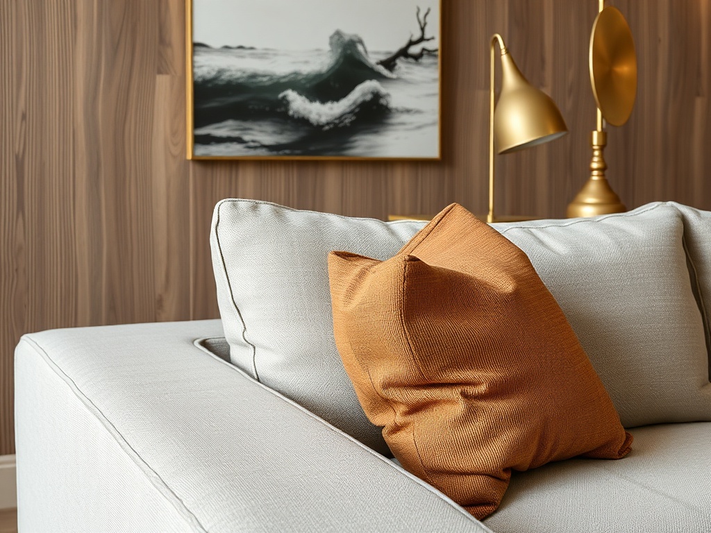
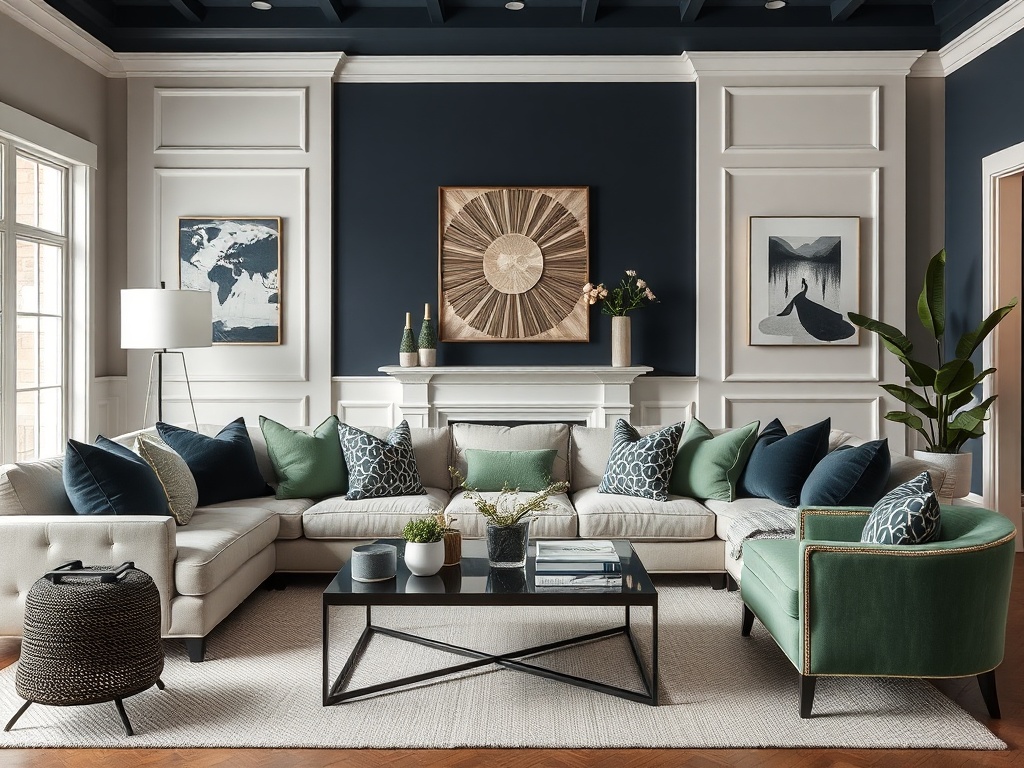
Step 4: Introduce Material Contrast (Your Room Is Too Polite)
Rooms fall apart when everything is the same texture. If you have boucle, linen, and matte paint all sitting politely together, the room lacks tension.
You need contrast: something reflective (glass, brass), something rough (wood grain, stone), something soft (textile). This is what gives a room depth.
Unlacquered brass is my go-to because it develops patina over time. It records the history of the room—something plastic will never do.
The Save: Thrifted ceramics, vintage wood trays.
The Splurge: Solid stone surfaces or real metal hardware.
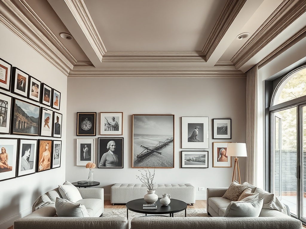
Step 5: Address the Walls (Yes, Including the Fifth Wall)
Blank walls are not minimalism. They’re missed opportunities.
You need vertical anchoring—art, shelving, or architectural detailing—to pull the eye upward. Otherwise, everything stays visually compressed at seating height.
And let’s talk about the ceiling—the fifth wall. If it’s builder-grade white, you’ve left one of the largest surfaces in the room completely unconsidered.
Even a subtle shift—like a warmer white or a soft tint—can change the spatial perception dramatically.
Step 6: Edit Ruthlessly (This Is Where Most People Fail)
A room that feels “off” is often just overcrowded. Not every surface needs an object. Not every corner needs to be filled.
Remove 20% of what’s in the room. Then reassess. You’re not aiming for emptiness—you’re aiming for clarity.
(If everything is sentimental, nothing is special. That’s not harsh—it’s math.)
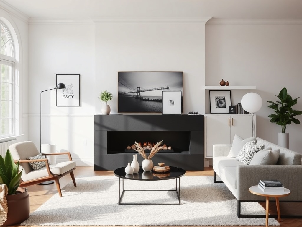
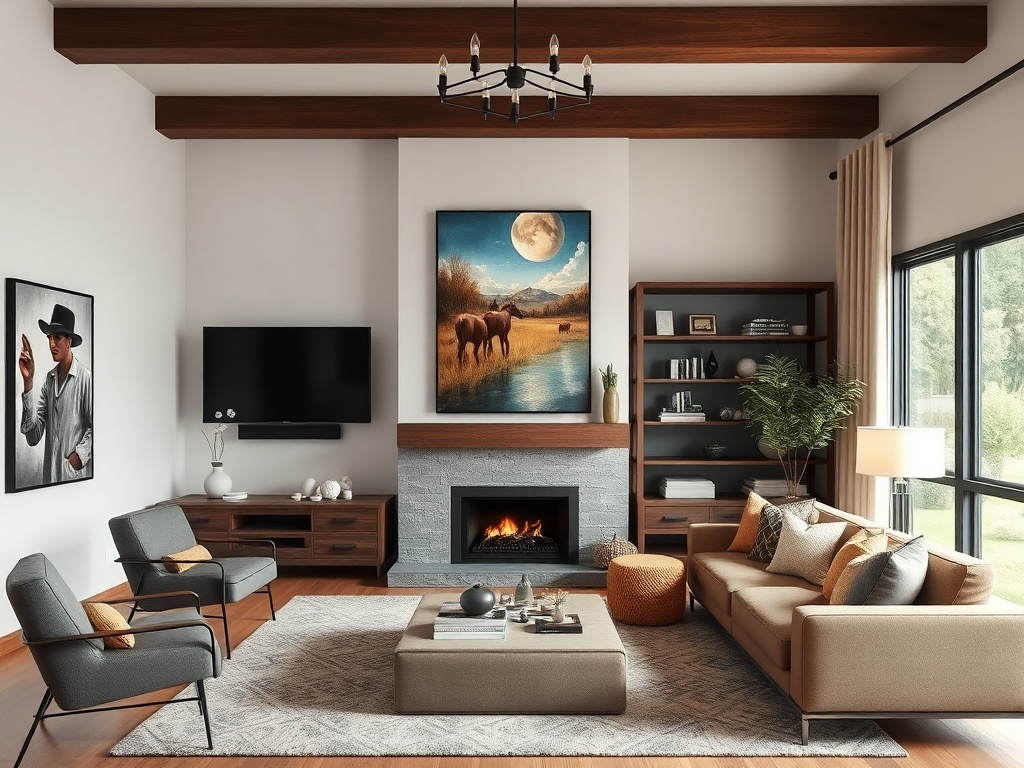
Step 7: Create a Focal Point (Stop Letting the TV Win)
If your TV is the only focal point, your room will always feel utilitarian.
You need a competing anchor—fireplace, large-scale art, or even a sculptural coffee table. Something that holds visual weight when the screen is off.
This is where composition comes in. Balance the focal point with surrounding elements so it feels integrated, not tacked on.
Step 8: Ground the Room with Color (Goodbye, Sad Beige)
Neutral doesn’t mean lifeless. But if your palette is entirely beige-on-beige, the room lacks contrast.
Introduce one anchoring color—deep green, oxblood, navy—and repeat it subtly across the room. This creates cohesion without turning the space into a theme park.
(Color repetition is the glue. Without it, everything floats.)
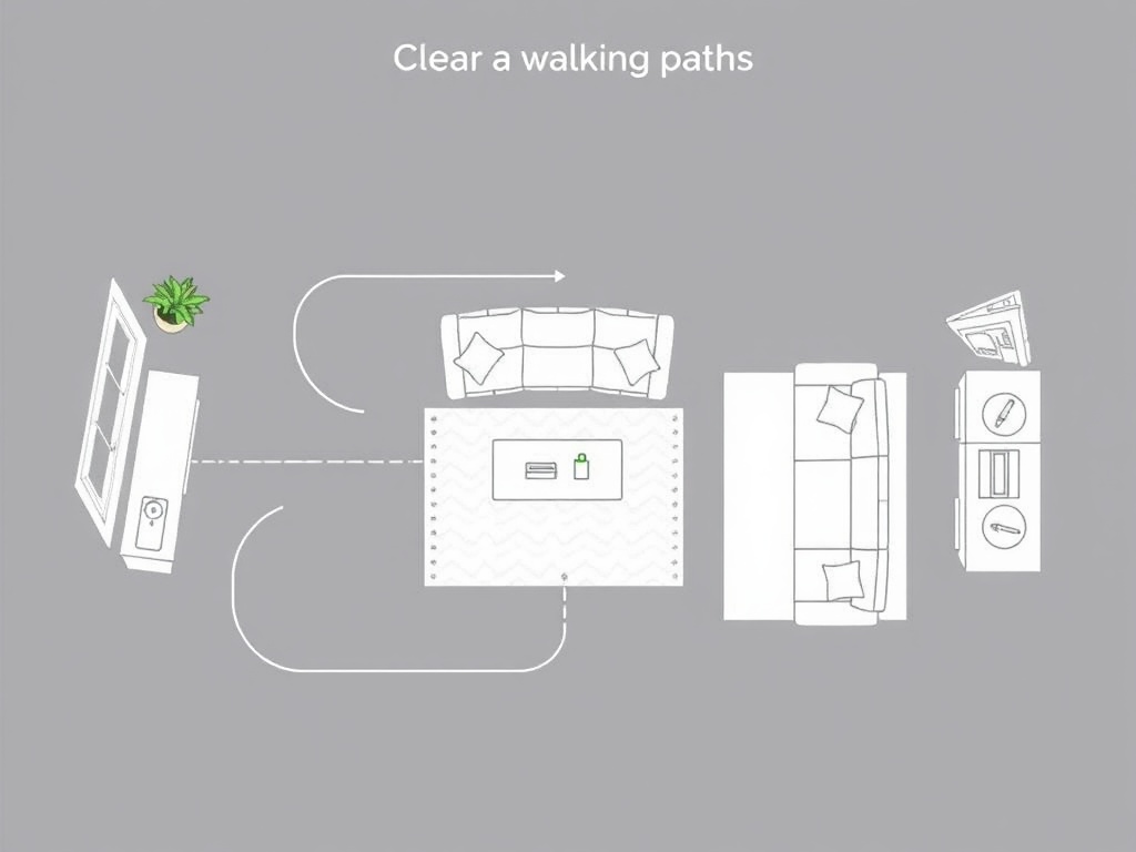
Step 9: Check the Layout Flow (Function Is the Backbone)
If you have to awkwardly sidestep furniture to move through the room, the layout is broken.
Maintain clear circulation paths—at least 30–36 inches where people walk. Furniture should guide movement, not obstruct it.
This is where many Pinterest-inspired layouts fail. They look good in photos but collapse in real life.
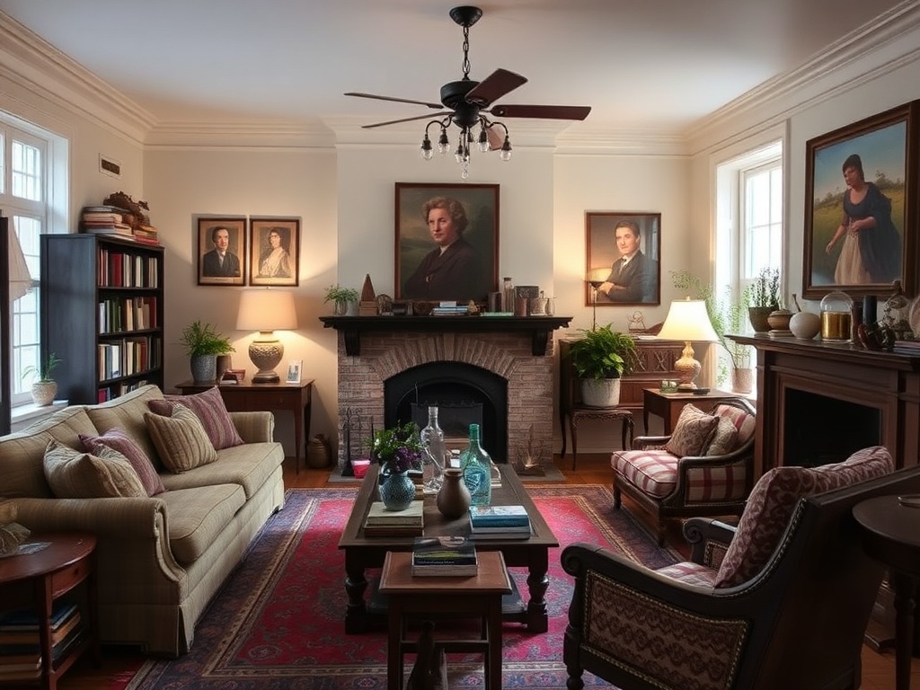
Step 10: Layer in the Human Element
This is the final pass—and the one that separates a designed room from a catalog page.
Add something personal but tactile: a vintage textile, a stack of worn books, an object with provenance. Not clutter—evidence of life.
This is where the room gains a pulse.
The Anatomy Recap
If your living room feels off, it’s rarely a single issue. It’s a chain reaction:
- Undersized rug → floating layout
- No hierarchy → visual confusion
- Poor lighting → flat atmosphere
- No material contrast → lack of depth
- Ignored walls → compressed space
Fix the structure, and the aesthetics follow. Not the other way around.
James, if any of the sources you’re considering for rugs or lighting have lead times over 12 weeks, we pivot. No one is waiting a quarter to fix a scale problem.
For everyone else: design isn’t magic. It’s decisions, layered correctly.
Steps
- 1
Diagnose the Scale Problem
- 2
Establish Furniture Hierarchy
- 3
Fix Lighting Layers
- 4
Introduce Material Contrast
- 5
Address Walls and Ceiling
- 6
Edit Ruthlessly
- 7
Create a Focal Point
- 8
Ground with Color
- 9
Check Layout Flow
- 10
Layer the Human Element