How to Style a Bookshelf Like an Interior Designer

What This Post Covers—and Why Bookshelf Styling Actually Matters
A bookshelf is more than storage. Done well, it becomes architecture in miniature—a composition that anchors a room, tells a story, and solves the puzzle of vertical space. This guide breaks down the exact layering techniques interior designers use to transform cluttered catch-alls into curated displays. You'll learn the rule of thirds for vertical space, how to balance weight and visual breathing room, the strategic use of negative space, and specific product recommendations that work at every price point. No styling experience required. Just a willingness to see the shelf as a three-dimensional canvas.
What Is the "Rule of Thirds" for Bookshelf Styling?
The rule of thirds is a compositional principle borrowed from photography and architecture—divide the vertical space into three sections, and place visual anchors at the intersection points rather than dead center.
Most people default to symmetry. They center everything. A vase here, a stack of books there, perfectly mirrored. The result? Static. Predictable. A bit catalog-ish.
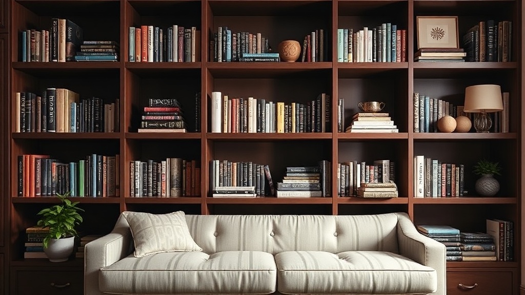
Here's the thing: asymmetry creates movement. On a standard 72-inch IKEA BILLY bookcase (the workhorse of budget design), treat each shelf as three distinct zones. Place the heaviest visual element—the densest cluster of books, the largest object—either in the left or right third, never the middle. The middle third becomes breathing room. Negative space. This simple shift transforms a shelf from storage unit to intentional design statement.
Weight matters too. Visual weight isn't literal pounds—it's how much attention an object demands. A glossy ceramic vase in matte black pulls the eye more than a pale linen box of identical size. A row of uniform Penguin Classics registers as a single visual unit. A single sculptural object in brushed brass stands alone. Alternate heavy and light across the vertical plane. A dense bottom shelf grounds the composition. A lighter, airier top shelf keeps things from feeling squat or compressed.
Worth noting: this rule applies whether the shelf holds mostly books, mostly objects, or a mix. The proportions change, but the principle doesn't.
How Do You Balance Books and Decorative Objects?
The sweet spot is roughly 60% books, 40% objects—though rigid ratios matter less than visual rhythm and intentional variation in height, texture, and grouping.
Books provide structure. They're rectangular, stackable, and come with built-in color palettes (spines, edges, or custom jackets). Objects provide punctuation. They break up the grid. The trick is integration, not alternation. Don't line up book-object-book-object like fence posts. Cluster books in uneven stacks—three here, seven there, one standing vertically as a bookend. Nest objects within those clusters. A small brass dish on top of a horizontal stack. A ceramic figure tucked beside vertical spines.
Color coordination is divisive. Some designers arrange by the rainbow—ROYGBIV spines creating a gradient across the shelf. Others group by tone: warm neutrals together, cool blues and greens in another zone. The catch? Both approaches work, but they communicate different things. Rainbow sorting reads playful, collected over time, slightly bohemian. Tone-on-tone reads editorial, intentional, gallery-like. There's no wrong choice—just a mismatch between the method and the room's overall mood.
For a cohesive look without full chromatic commitment, consider turning books spine-in (controversial, but effective in minimalist spaces) or using archival dust jackets in uniform kraft paper. The pages become the color—warm cream, clean white, the occasional deckled edge. This works particularly well in Japandi or Scandinavian-inspired interiors where visual quiet is the goal.
Objects should earn their place. Every item needs a reason—scale, texture, provenance, or sheer delight. Avoid the "shelf as museum of random vacation tchotchkes" trap. A single large piece (the CB2 Charade Bust in white plaster, perhaps, or a vintage amphora from a flea market) has more impact than seven small items fighting for attention. Scale up. Edit ruthlessly.
Should You Organize Books by Color, Size, or Subject?
For visual impact, organize by color or size. For functionality, organize by subject or author. The best shelves do both—segregating reference books by topic in less visible zones while styling display-worthy volumes for maximum aesthetic effect.
Here's a practical framework:
| Organization Method | Best For | Visual Result | Trade-off |
|---|---|---|---|
| By color | Living rooms, styled interiors, Instagram moments | High impact, rhythmic, editorial | Finding a specific book becomes a treasure hunt |
| By size | Clean, architectural aesthetics; mixed collections | Orderly, balanced, gallery-like | Breaks up series and collections |
| By subject | Home offices, libraries, study spaces | Functional, intuitive, browsable | Visual chaos if subjects span many colors/sizes |
| By read/unread status | Avid readers with deep backlogs | Personal, meaningful | Constantly changing; hard to maintain visually |
Hybrid approaches solve the functionality-versus-form dilemma. Organize the bottom shelves (at eye level when seated, less visible) by subject for easy access. Style the upper shelves by color for visual impact from across the room. Or keep fiction alphabetical by author on one side of the shelf, arranged by color on the other—functional for the books you reach for, decorative for the ones that just look good.
That said, some books are simply too beautiful to hide in alphabetical order. Art books. Photography collections. Vintage hardcovers with deckled gold edges. These become objects themselves, displayed face-out on stands (the West Elm Smart Stand in brass is worth the splurge at $24) or stacked horizontally to show off binding details.
Working with What You Have
Not everyone owns a library of mint-condition design books in coordinated neutrals. Most collections are accumulated over decades—paperbacks with cracked spines, mismatched series, gifts from relatives with... questionable taste.
The solution? Grouping and editing. Pull everything off the shelf. (Yes, everything.) Sort into keep, donate, relocate. The cookbooks go to the kitchen. The outdated tech manuals go to recycling. What's left is the core collection—books that matter, look decent, or both.
Now group by approximate color family. All the blacks and grays together. The reds and oranges. The whites and creams. Within each group, alternate horizontal and vertical stacking. Horizontal stacks create platforms for objects. Vertical rows provide rhythm. Place the largest, most cohesive color group on the most visible shelf—usually center or just below eye level. Use smaller, scrappier groupings (the miscellaneous blues that don't quite match) higher up or tucked in corners.
How Much Empty Space Should You Leave on a Shelf?
Aim for 20-30% empty space per shelf—what designers call "breathing room"—to prevent visual clutter and allow individual objects to register as intentional choices rather than accumulations.
This is where most DIY styling goes wrong. The instinct is to fill every inch. Maximize storage. Use all the real estate. The result reads as hoarding, not curation. Empty space isn't waste—it's punctuation. It creates hierarchy. It tells the eye where to rest.
The 20-30% rule breaks down practically: on a 36-inch wide shelf, leave roughly 7-11 inches completely clear. Not necessarily contiguous—scatter the gaps. A 4-inch void between two book clusters. A 3-inch margin at the end of a row. These pauses allow the composition to breathe.
Depth matters too. Don't push everything to the front edge like store display. Stagger objects front-to-back. A shallow brass tray near the front edge. A taller vase recessed slightly. This creates layers, dimension, shadow. The shelf becomes three-dimensional rather than a flat tableau.
Lighting transforms everything. If the shelf doesn't have integrated lighting (most built-ins and quality cases from Room & Board now offer LED options), add it. Battery-powered puck lights work in a pinch, but hardwired LED strips—warm 2700K temperature, not the harsh blue-white of cheap alternatives—wash each shelf in a glow that reads expensive regardless of the objects displayed. Worth the electrician visit for shelves you look at daily.
Common Mistakes—and How to Fix Them
Everything at the same height. Vary it. Use risers (stacked books work) to lift small objects. Let tall items stand alone.
Objects lined up like soldiers. Angle that ceramic bowl. Offset the framed photo. Asymmetry creates interest.
Ignoring the sides. The vertical edges of a shelf frame the composition. Don't crowd them. Leave an inch or two of clearance—makes the whole thing feel intentional.
Forgetting the floor. The space beneath the bottom shelf counts too. A woven basket (the Container Store's White RITZ bins are classics) or a low plant softens the base and grounds the piece in the room.
The goal isn't perfection. It's intentionality. A bookshelf that looks considered—that tells a story about what you value, what you've collected, how you see the world. Start with the rule of thirds. Edit to 70% full. Step back. Adjust. The shelf will tell you what it needs.
Steps
- 1
Start with a Clean Slate and Edit Your Collection
- 2
Create Balance with the Rule of Thirds
- 3
Layer in Decorative Objects and Greenery