The Anatomy of a Living Room That Actually Works (And Why Yours Feels Off)

Let’s look under the hood of your living room. Not the curated, perfectly lit version you saved on Pinterest—the one you actually live in. The one that somehow feels "off" no matter how many pillows you throw at it (and yes, we need to talk about that).
What you’re experiencing isn’t a taste problem. It’s a systems failure. Living rooms are spatial equations—scale, proportion, material contrast, and light distribution—and when even one variable is off, the entire composition collapses.
The Real Culprit: Scale (Not Style)
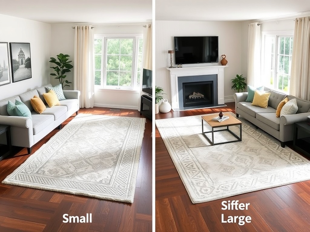
Most living rooms fail at the most basic architectural level: scale. That 5x7 rug floating under your coffee table? It’s not "cozy." It’s mathematically incorrect.
Here’s the rule: your rug should anchor the entire seating system, not just flirt with it. In most standard living rooms, that means an 8x10 minimum, and more often a 9x12 (yes, even if it feels excessive).
(For the nerds in the back: you want at least the front legs of all major seating pieces on the rug. This creates a unified plane of visual gravity.)
When the rug is underscaled, everything above it feels like it’s drifting. You’ve essentially removed the floor from your composition.
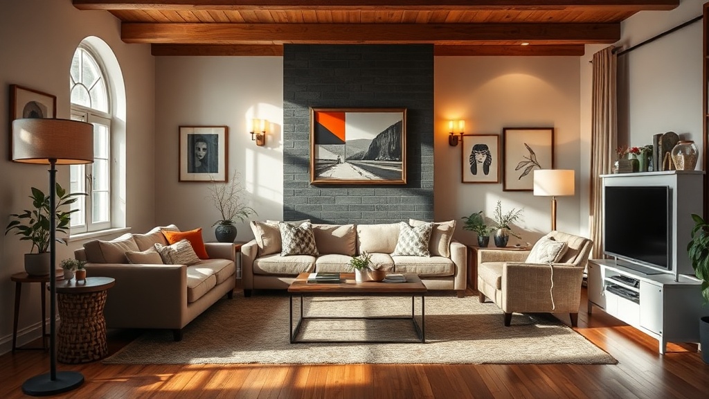
The Sofa Is Not the Star (It’s the Anchor)
We need to dismantle a myth: the sofa is not the main character. It’s the anchor.
A good sofa does one thing exceptionally well—it establishes horizontal mass. That’s it. If you’re expecting it to carry the entire room, you’re setting yourself up for failure.
The real magic happens in the supporting cast:
- A chair with a different silhouette (introducing tension)
- A textile with actual weight (look for 300–600 GSM, not the paper-thin throws flooding the market)
- A table with material contrast (wood vs. stone vs. metal)
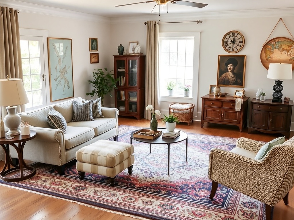
This is where the high-low mix lives. A mid-market sofa paired with a vintage chair will always outperform a matching set. Matching furniture is visual monotony—it tells me you bought a room, not designed one.
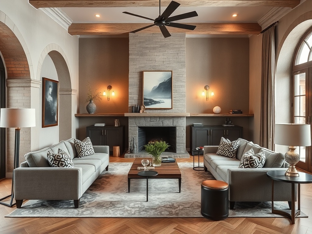
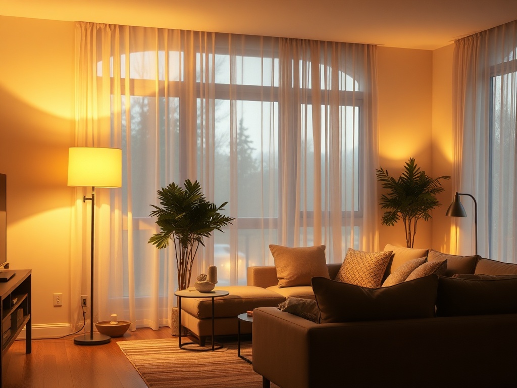
Lighting: Stop Relying on the Ceiling
If your entire room is lit by a single overhead fixture, we have a problem. And no, adding a dimmer does not fix bad lighting strategy.
Good lighting is layered:
- Ambient (general illumination)
- Task (reading lamps, directional light)
- Accent (highlighting texture and material)
Here’s the reality: overhead lighting flattens everything. It erases texture, kills shadows, and makes your space feel like a waiting room.
Instead, you want at least three independent light sources at different heights. Think: a floor lamp (approx. 60" height), a table lamp, and a low ambient glow (even a shaded bulb on a console).
And for the love of structural integrity—no integrated LEDs. If you can’t change the bulb, the fixture is disposable. We’re building rooms that age with dignity, not landfill timelines.
The Fifth Wall (Yes, Your Ceiling Matters)
Most people ignore the ceiling entirely, which is equivalent to designing a room with one wall missing.
The ceiling is your largest uninterrupted plane. Leaving it builder-grade white is a missed opportunity for tension and depth.
Options that actually work:
- A soft tonal shift (off-white with warmth)
- A subtle plaster texture
- Even a matte color if the room can handle it
This isn’t about drama for drama’s sake. It’s about closing the box so the room feels intentional.
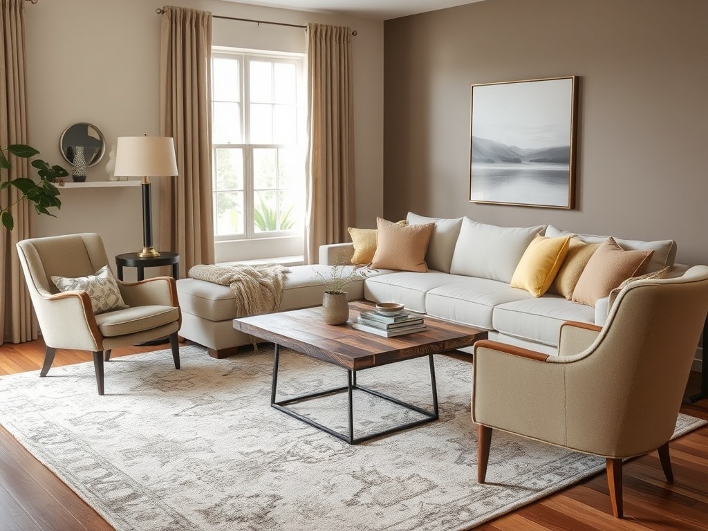
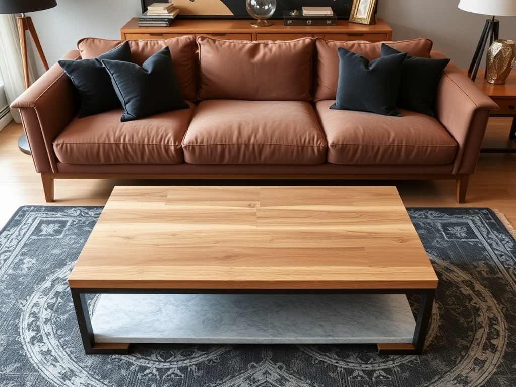
The Coffee Table Problem (It’s Usually Wrong)
Your coffee table is likely either too small, too tall, or made of the wrong material. Sometimes all three.
Here’s the anatomy of a correct coffee table:
- Height: within 1–2 inches of your sofa seat height
- Length: roughly two-thirds the length of your sofa
- Material: contrasting your dominant upholstery
If your sofa is upholstered, your table should introduce hardness—stone, wood, or metal. This creates material tension, which is what makes a room feel layered instead of flat.
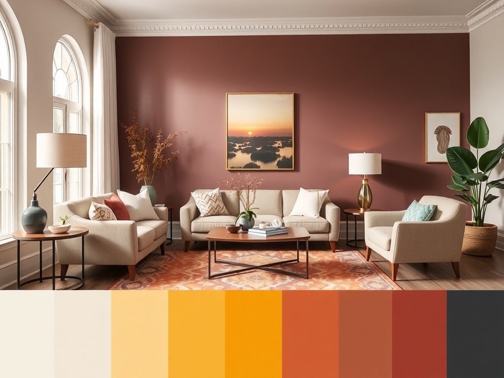
Color Isn’t the Problem—Distribution Is
People love to blame color when a room feels off. "Maybe I chose the wrong shade." No. You distributed it poorly.
Color should move through a room, not sit in one corner like it’s in time-out.
Think in thirds:
- 60% dominant (walls, large furniture)
- 30% secondary (rugs, curtains)
- 10% accent (pillows, objects)
When all your color is concentrated in throw pillows, you’ve created visual imbalance. Spread it across planes—vertical, horizontal, and tactile.
The Splurge vs. The Save (Where It Actually Matters)
Let’s be precise about where your money should go.
Splurge:
- Rug (foundation of the room)
- Primary seating (comfort + durability)
- Hardware and materials that age (unlacquered brass, solid wood)
Save:
- Side tables (easy to swap over time)
- Lamps (as long as sockets are standard)
- Decor objects (this is where vintage wins every time)
The goal isn’t to spend less—it’s to spend with intent.
The Final Diagnosis
If your living room feels off, it’s almost never because you lack taste. It’s because the underlying structure—the math of the room—isn’t resolved.
Fix the scale. Anchor the layout. Layer your lighting. Introduce material contrast. Treat the ceiling like it matters.
Do that, and suddenly the room stops fighting you.
And if you take nothing else from this: stop buying matching sets. You’re not furnishing a showroom—you’re building a space with a pulse.