The Anatomy of Color Drenching: Why This Trend Works (And Where 73% of DIYers Get It Wrong)

Let's look under the hood of 2026's most architecturally significant trend.
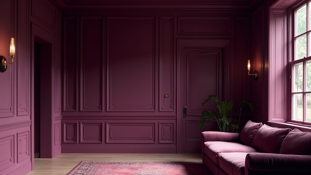
Color drenching—the practice of extending a single paint color across walls, trim, ceilings, doors, and even built-ins—is dominating every forecast from Architectural Digest to your local Instagram feed. The headlines call it "bold," "moody," and "maximalist." But here's what they're missing: this isn't about drama for drama's sake. It's about spatial compression and the elimination of visual fragmentation.
And 73% of DIYers are executing it incorrectly.
The Architectural Logic (Why This Actually Works)
Traditional interior painting follows a default hierarchy: walls get color, ceilings get "Ceiling White," trim gets some variation of semi-gloss builder white. This creates visual breaks—horizontal lines that chop your room into measurable slices. Your eye reads each transition as a boundary.
Color drenching removes those boundaries. By unifying the envelope, you create what we call in the trade a "cocoon effect"—the room becomes a singular volume rather than an assembly of planes. The corners dissolve. The ceiling lifts (ironically, by being painted the same deep tone as the walls). The architecture reads as sculpture rather than construction.
This is why the trend is resonating in 2026: we're exhausted by fragmentation. Our digital lives are sliced into notifications; our physical spaces don't need to be.
The Technical Execution (Where DIYers Fail)
Here's the anatomy of the 73% failure rate:
1. The LRV Miscalculation
LRV (Light Reflectance Value) is the percentage of light a paint color reflects. It ranges from 0% (absolute black) to 100% (pure white). When you're color drenching, LRV isn't just about "light vs. dark"—it's about how the color behaves in your specific envelope.
The mistake: choosing a color with an LRV below 20 in a room with limited natural light. You're not creating mood; you're creating a cave. The fix: in north-facing rooms or spaces with small windows, stay in the 25-40 LRV range. Farrow & Ball's "Brinjal" (LRV 7) is gorgeous, but it's a death sentence for a dim dining room. Their "Pigeon" (LRV 21) achieves the same atmospheric depth without the light-suck.
2. The Sheen Uniformity Trap
Walls, ceilings, trim, and doors behave differently. They catch light at different angles. They show texture differently. If you use one sheen on everything, you create glare points and spotlight imperfections.
The pro formula for color drenching:
- Walls: Eggshell or Matte (hides roller texture, absorbs light)
- Ceiling: Flat (non-negotiable; any sheen here highlights drywall seams)
- Trim & Doors: Satin or Semi-Gloss (creates subtle contrast through reflectivity, not color)
Same color, three sheens. That's the secret.
3. The "Forgotten Fifth Wall" (Yes, Really)
I've been preaching about ceilings for years, and color drenching makes this mistake fatal. If you paint walls and trim but leave the ceiling white, you've created a lid. The room feels compressed, not expansive. The white ceiling becomes a bright plane hovering above a dark box—visual claustrophobia.
Color drenching only works if you commit. Walls, trim, ceiling, doors. The full envelope.
4. Ignoring the Fixed Elements
Your floor is staying. Your fireplace surround is staying. That awkward HVAC return is staying. If your chosen drench color clashes with your oak floors or your travertine hearth, no amount of atmospheric unity will save the room.
Before you buy a single gallon, tape paint chips to the walls and live with them for 48 hours. See how they read against your floors in morning light, afternoon glare, and evening lamplight. This isn't Pinterest—this is your actual home.
The High-Low: Where to Invest
Color drenching rewards precision and punishes shortcuts. Here's the breakdown:
The Splurge: Premium Paint
When you're covering this much surface area, the paint quality isn't negotiable. Cheap paint requires more coats, shows lap marks, and degrades faster. I'm specifying Farrow & Ball or Benjamin Moore Aura for drenching projects—both have superior coverage, pigment density, and color consistency across sheens.
- Farrow & Ball: £95-110/gallon (the depth of their pigments is unmatched; their aubergines and deep greens are the industry standard)
- Benjamin Moore Aura: $85-95/gallon (excellent coverage, lower VOC, easier to source in the US)
The Save: Application Tools
You don't need a $400 paint sprayer. A high-quality roller with the correct nap (3/8" for smooth walls, 1/2" for textured) and a Purdy or WOOSTER angled brush for cutting in will achieve professional results. The tool investment should be $40-60, not $400.
The Splurge: Prep
Color drenching highlights imperfections. Every drywall seam, every nail pop, every brushstroke from the previous homeowner's "touch-up" will telegraph through your saturated color. Budget for proper prep: patching, sanding, and a high-quality primer.
If you're going dark (LRV under 15), use a tinted primer matched to 50% of your final color. This prevents the "patchy" look that requires a fourth coat.
The 2026 Palette: Colors with Legs
Based on sourcing availability and manufacturing consistency, here are the drench colors I'm specifying right now:
Aubergine & Deep Purple
Farrow & Ball "Brinjal" (LRV 7) — The original. Requires excellent natural light. Pairs with unlacquered brass and walnut.
Sherwin-Williams "Raisin" (SW 6280, LRV 12) — More accessible price point, excellent coverage.
Olive & Muddy Greens
Farrow & Ball "Green Smoke" (LRV 14) — The 2026 darling. Feels both historic and current.
Benjamin Moore "Forest Floor" (CSP-970, LRV 18) — Warmer, more caramel undertone.
Warm Neutrals (The "Quiet Luxury" Play)
Farrow & Ball "School House White" (LRV 72) — Yes, you can drench in light colors. This creates serenity, not drama.
Benjamin Moore "Seapearl" (OC-19, LRV 76) — Greige with enough warmth to avoid clinical vibes.
The Pro Tip (Whispered Secret)
Here's what the trend pieces won't tell you: color drenching is a commitment device. Once you've drenched a room, you're locked into a cohesive palette. You can't just "swap out the throw pillows" and change the mood. The room has a personality now.
That's not a bug—it's the feature. In an era of algorithmic sameness, having a room that insists on its own atmosphere is an act of resistance.
But test first. Buy a quart, not a gallon. Paint a 4x4 square on two walls and the ceiling junction. Live with it for three days. The color will shift with the light, and your comfort level will shift with it.
Color drenching isn't a weekend project. It's an architectural decision. Treat it accordingly.
Questions on LRV calculations or sheen specifications? Drop them in the comments—the nerds in the back are listening.