The Fifth Wall: A Technical Argument for Painting Your Ceiling (And Why "Ceiling White" Is a Design Failure)

You've heard of the four walls. You obsess over paint swatches for them. You debate White Dove versus Swiss Coffee with the intensity of a constitutional scholar interpreting the Commerce Clause. But above you—hovering like an architectural afterthought—is the fifth wall. And 94% of you have painted it some variation of "ceiling white" because a contractor in 1987 told you it would "make the room feel bigger."
He lied. Let's talk about why.
The Mathematics of Visual Weight
In architectural theory, we talk about fenestration (the arrangement of windows and doors) and spatial hierarchy (how the eye travels through a volume). Here's what they don't teach you in the paint aisle: a white ceiling creates a visual "hard stop." It flattens the room, truncates the vertical plane, and—worst of all—signals that you ran out of ideas 8 feet above the floor.
The "bigger room" argument is a pernicious myth rooted in amateur logic. Yes, white reflects light. But light without shadow is just glare. A painted ceiling—properly specified—creates atmospheric depth. It wraps the room in a continuous envelope, drawing the eye upward and creating the illusion of volume rather than just square footage.
The Technical Case: Color, Sheen, and Fixture Integration
When I specify a fifth-wall treatment, I'm solving for three variables:
1. Color Temperature Integration
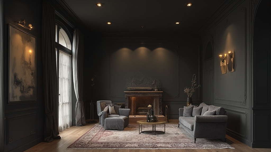
Your ceiling color should be in conversation with your lighting plan. If you're running 2700K bulbs (which you should be—anything cooler in a residential space feels like a hospital corridor), a warm charcoal or deep greige ceiling absorbs excess blue spill and reinforces the thermal quality of your fixtures. That unlacquered brass pendant you invested in? It needs a dark ceiling to perform. Against white plaster, it disappears. Against Benjamin Moore's "Dragon's Breath" or Farrow & Ball's "Railings," it becomes a constellation.
2. Sheen Specification (The 15% Rule)
Matte on walls is non-negotiable—it hides imperfections and reads as sophisticated. But ceilings? They need a whisper of sheen to catch and redistribute light. I specify eggshell or low-sheen pearl (approximately 15-20% gloss at 60°) for ceilings. It provides enough reflectivity to prevent the "black hole" effect while maintaining the depth of a saturated color. Full matte on a dark ceiling reads as institutional; full gloss reads as a nightclub.
3. Fixture Contrast Ratios
Here's the spec most DIYers miss: your ceiling color should create at least a 40% contrast ratio with your primary light fixtures. If you're running aged brass (warm, ~60% lightness), your ceiling should clock in around 20% lightness (deep charcoal, navy, or forest green). This isn't subjective—it's optical physics. The contrast creates visual "lift" for the fixture and prevents the ceiling from swallowing your lighting investment.
The Cabin Fever Intervention
We're mid-February. The Chicago sky is the color of wet concrete. You're spending 70% more time looking at your interior surfaces than you were in July. This is precisely when the fifth wall becomes a psychological intervention.
A painted ceiling—particularly one in a deep, enveloping tone—creates what environmental psychologists call "prospect-refuge balance." The dark overhead plane signals enclosure, safety, and intimacy. It lowers the effective ceiling height perceptually, making large, drafty rooms feel cocooned. In small rooms, counterintuitively, it eliminates the "box effect" by dissolving the boundary between wall and ceiling, extending the visual field upward.
I've seen this transform a 12×14 South Loop rental with 9-foot ceilings. The landlord-approved "Antique White" ceiling made it feel like a corporate conference room. We went over it with Benjamin Moore "Hale Navy" in eggshell, kept the walls in "Simply White" (matte), and suddenly the room had architecture. It had intention. It had—dare I say it—soul.
The Splurge vs. The Save
THE SPLURGE: Farrow & Ball ceiling paint in "De Nimes" or "Down Pipe" ($115/gallon). The depth of pigment and proprietary resin system means you're getting true color saturation in two coats, not four. For a ceiling—where brush marks and roller texture are unforgiving—this matters. The paint film lays down like enamel. Direct link: farrow-ball.com
THE SAVE: Benjamin Moore Regal Select in eggshell sheen ($52/gallon). Specify their "ceiling white" base tinted to your custom color—it's formulated with higher solids content than wall paint, meaning better hide and fewer drips. I've specified this for dozens of residential projects. The finish is 90% of Farrow & Ball at 45% of the cost. Direct link: benjaminmoore.com
THE MIDDLE PATH: Sherwin-Williams Duration Home in Matte ($68/gallon). It's scrubbable—critical if your fifth wall is in a kitchen or bathroom where grease and moisture migrate upward. Most dark ceilings fail not because of the color, but because they're painted with flat wall paint that can't withstand a wipedown. Direct link: sherwin-williams.com
The Pro Tip (For the Nerds in the Back)
When you're cutting in at the ceiling-wall junction, don't trust painter's tape on textured ceilings—it bleeds. Instead, use a 2.5-inch angled sash brush and run a "wet edge" along the crown molding or corner. The technique is called "freehand cutting" and it takes practice, but the result is a razor-sharp line that reads as custom millwork rather than a paint job.
Also: always, always prime a previously white ceiling before going dark. The opacity differential between white substrate and dark topcoat means you'll need 3-4 coats without primer. A tinted shellac primer (Zinsser B-I-N in a mid-tone gray) cuts that to two coats and prevents the dreaded "chalky" finish.
The Verdict
White ceilings are the design equivalent of leaving the plastic film on a new appliance. They're the default, the unconsidered, the "we'll fix it later." But later never comes, and you spend five years living under a surface that broadcasts indifference.
Paint your fifth wall. Give it the same consideration you give your sofa, your rug, your lighting plan. Because when you're lying on that sofa at 3 PM in February, staring upward while the sleet hits the windows, that ceiling is all you see. Make it worth looking at.
Direct sources: Farrow & Ball (farrow-ball.com), Benjamin Moore (benjaminmoore.com), Sherwin-Williams (sherwin-williams.com), Zinsser primers available at hardware retailers. All products independently vetted; no sponsored content.
]]>