Why a Narrow Entryway is Actually a Design Asset (Not a Design Flaw)

The Misconception That Narrow Equals Bad
Most people treat a narrow entryway like a spatial liability—an awkward squeeze to tolerate on your way to the "real" rooms. But that's backwards. A slender entry, when handled intentionally, creates drama, sequence, and a sense of arrival that sprawling open-concept foyers simply can't replicate. The problem isn't the width—it's the way we've been taught to fill it.
For years, design magazines have paraded double-height ceilings and sweeping staircases as the gold standard of entryways. That's lovely if you live in a converted Victorian, but the rest of us are working with 36-inch corridors and shoebox apartments. Here's the architectural truth: narrow passages are some of the most memorable spatial experiences in great design. Think of the compressed entry sequence leading into Fallingwater—that tight, dark approach makes the explosion of glass and river view hit harder. Your hallway can do the same thing on a domestic scale. The key is learning to edit rather than expand.
Where Should You Place Furniture in a Narrow Entryway?
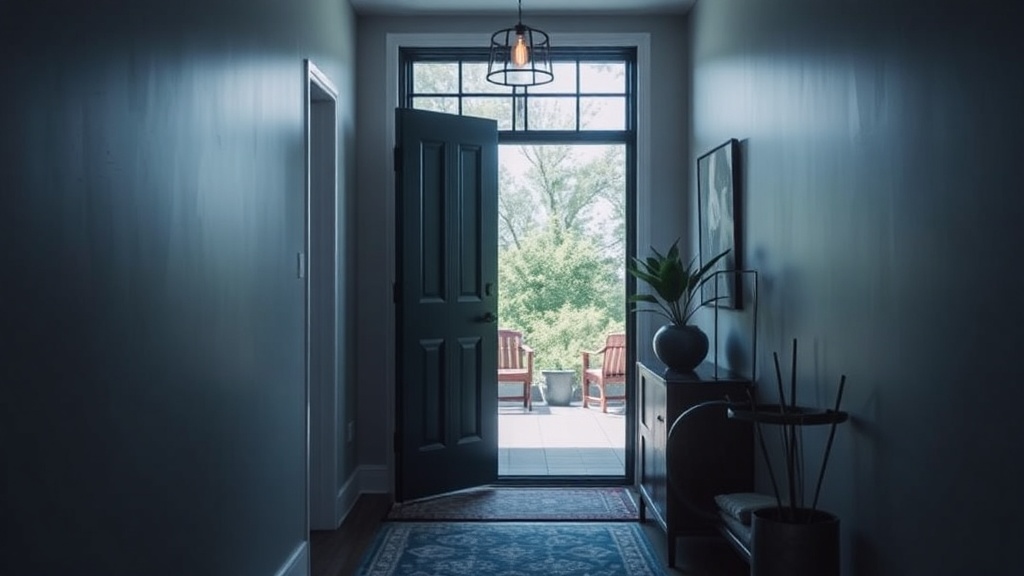
The short answer: you probably shouldn't. At least, not the way you've been imagining. A console table sounds practical—drawers for keys, a surface for mail—but in a corridor under four feet wide, that 15-inch-deep piece of furniture steals nearly half your walking space. Suddenly you're shimmying sideways just to get to the kitchen.
Instead, think in profiles, not footprints. A floating shelf at hip height (around 36 inches) gives you that drop zone without the bulk. Mount it at the precise depth of your door frame's swing radius—usually about 3 inches beyond the casing—and you've created a ledge that feels intentional rather than apologetic. Add a small mirror above it at eye level, and you've doubled the perceived width through reflection without sacrificing a single square inch.
If you absolutely need closed storage, go vertical and shallow. Wall-mounted cabinets with a depth of 8 inches or less—similar to a medicine cabinet—can house sunglasses, dog leashes, and that one umbrella that actually works. Position them above head height (78 inches or higher) so they don't close in the space. The floor stays clear, the sightlines stay open, and your brain registers the room as bigger than it is.
What Colors Make a Narrow Entryway Feel Wider?
Here's where conventional wisdom gets it wrong. Everyone tells you to paint small spaces white—reflect the light, open it up, blah blah blah. But a narrow hallway painted stark white often feels like a hospital corridor: bright, yes, but also completely featureless and somehow longer in the worst way.
The move is to go darker and more saturated than you think you should. A deep charcoal, forest green, or even a matte navy creates depth by absorbing light at the walls' edges. Your peripheral vision can't quite grab onto boundaries, so the space feels expansive rather than constricted. Paint the ceiling the same color—yes, really—and you eliminate the visual stop that a white ceiling creates. The walls appear to float upward indefinitely.
If moody paint feels too permanent, try a high-contrast trim in a warmer white than your walls. This trick—painting baseboards, door frames, and crown in something like Benjamin Moore's "White Dove" against a softer wall color—draws the eye horizontally instead of vertically. It emphasizes the room's length as a feature, not a flaw. For more on the psychology of color in spatial perception, Architectural Digest breaks down the science here.
How Do You Create Storage Without the Bulk?
The real genius of narrow entry design is recognizing that storage doesn't have to look like storage. That radiator cover you've been meaning to replace? Build it out with a hinged top and suddenly it's a bench with hidden shoe storage. The wall opposite your door—probably blank and underused—is prime real estate for a floor-to-ceiling pegboard system. Painted the same color as the walls, it becomes texture rather than clutter.
Hooks are your best friend, but placement matters more than quantity. Most people hang hooks at random heights, creating visual noise. Instead, create a rhythm: one hook at 48 inches for coats, one at 36 inches for bags, one at 24 inches for children's backpacks or dog leashes. The alignment creates order, and order reads as spaciousness. Choose hooks with a projection of less than 3 inches—those chunky vintage hooks look great on Pinterest but will snag every sleeve that passes by.
For shoes—the eternal entryway enemy—consider a toe-kick drawer built into your baseboards. Cabinetmakers can retrofit these into existing trim for a few hundred dollars, and they swallow up to six pairs of shoes in space that was literally doing nothing. If that's too involved, a slim boot tray (no more than 2 inches high) in a material like brass or blackened steel elevates the utilitarian into something that reads as design.
Lighting: The Make-or-Break Element
Narrow entries often suffer from a single sad flush-mount fixture casting harsh shadows on everyone's face. The fix isn't more light—it's better light at different heights. Start with a narrow sconce (under 5 inches wide) mounted at 66 inches on the wall opposite your door. This sidelights visitors rather than toplighting them, which is infinitely more flattering.
Add a small LED strip above your floating shelf or cabinet, aimed upward to graze the wall. This creates a pool of reflected light that reads as volume. Finally, if you have a solid door, consider replacing the upper panel with frosted glass—or adding a transom window above it—to borrow light from adjacent rooms. The connection to other spaces makes the entry feel less like a tunnel and more like a passage.
The goal here isn't to trick anyone into thinking your entryway is grand. It's to make the compression feel deliberate—like a breath held before the exhale into your living space. Great design doesn't demand square footage; it demands decisions. And in a narrow entry, every inch is an opportunity to choose something interesting.
For inspiration from architects working in genuinely tight urban spaces, Dezeen's collection of narrow houses proves that constraints breed creativity. Your hallway isn't a problem to solve—it's a chance to make a first impression that actually means something.