Why Do Some Open Floor Plans Feel Chaotic Instead of Airy?

Here's something that'll stop you mid-scroll: 68% of homebuyers rank open floor plans as their top priority—yet nearly half report feeling stressed or scattered in these same spaces within six months of moving in. The architecture sells the dream of flow and connection. Reality often delivers echo chambers, visual clutter, and that nagging sense that you're living in one giant room that doesn't know what it wants to be.
This isn't about square footage. Some of the most peaceful, functional open-concept homes I've seen clock in under 900 square feet. The difference? Intentional zoning—dividing space without building walls. Below are six architectural strategies that create distinct "rooms" within open plans, each working at a real-world budget. No contractors required for most.
What Counts as a "Zone" Anyway?
Before diving into tactics, let's define what we're actually after. A zone isn't just furniture arranged in a blob. It's a defined area with a clear purpose, visual boundaries, and enough separation from adjacent spaces that your brain registers it as distinct. Think of it like this: when you step from a kitchen into a dining room in a traditional home, there's a threshold—an architectural cue that something has changed. Open plans strip away those cues. Our job is to put them back, just without the drywall.
The zones we'll cover below address the three most common open-concept headaches: the living area that bleeds into everything, the dining space that feels like an afterthought, and the kitchen that dominates the entire visual field. Each solution works solo or stacks with others. Mix and match based on your specific layout and pain points.
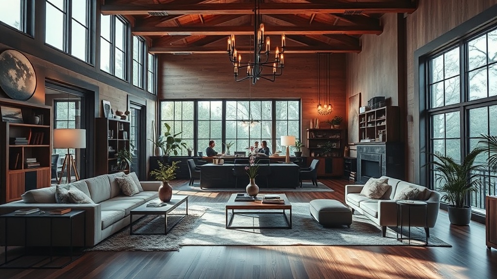
Can Rugs Really Define a Room Without Walls?
Yes—but most people size them wrong. The classic mistake: buying a rug that fits under the coffee table and calling it a living room anchor. In open plans, undersized rugs read as floating islands—random patches of pattern that emphasize the void around them rather than defining territory.
The rule I give clients: front legs on, back legs optional. In an open living area, every major seating piece should have at least its front two feet on the rug. This creates a visual "containment field" that signals "conversation happens here." For a standard three-seat sofa plus two chairs, you're looking at 8x10 feet minimum. Tight on budget? Natural fiber rugs (jute, sisal, seagrass) run 30-50% less than wool and hold up beautifully in high-traffic zones.
Placement matters as much as size. Center your rug on the room's focal point—usually a fireplace or the main seating view—not on the architectural center of the house. This subtle shift tricks the eye into seeing the seating group as a purposeful destination rather than furniture that got lost.
How Do You Create Privacy Without Blocking Light?
Open plans sacrifice enclosure for brightness. The workaround? Semi-transparent dividers that filter rather than block. Room-height shelving units (the backless kind, open on both sides) are the workhorse here. They carve out distinct territories while keeping sight lines and daylight intact.
The IKEA KALLAX and its ilk get a bad rap, but styled thoughtfully, these units read as architecture. Position one perpendicular to a wall to create a hallway effect, or float it behind a sofa to give that "back" some substance. The key is what goes on the shelves. For maximum zoning impact, keep the lower third solid—baskets, books, closed storage—and the upper two-thirds airy. This follows the same visual logic as a half-wall: solid base, open top. Your eye reads it as a boundary without feeling boxed in.
Alternative options at varying price points: Japanese shoji screens (authentic ones from Shoji Designs run $300-800 but last decades), tension-rod curtains in heavy linen ($150-400 depending on ceiling height), or even tall plants in repetitive rows (fiddle leaf figs or olive trees in matching planters create a soft green wall for under $200).
Why Does Lighting Beat Paint for Defining Zones?
Here's where my architecture background gets opinionated. Paint is permanent—or at least, it feels that way once you've committed to an accent wall. Lighting is flexible, layered, and more psychologically powerful than we give it credit for.
The human brain associates pools of light with activity areas. It's primal: firelight meant safety, gathering, cooking. Darker periphery meant "not here, not now." You can hack this hardwired response with three lighting layers per zone: ambient (general illumination), task (focused brightness for specific activities), and accent (decorative highlights that add depth).
In an open plan, the magic happens when you vary the color temperature between zones. Warm white (2700K-3000K) signals coziness—perfect for living areas. Neutral white (3500K-4000K) promotes alertness and appetite, ideal for kitchens and dining. By installing dimmable fixtures with tunable bulbs, you create invisible boundaries. Your brain registers the shift from warm to neutral as a threshold crossing, even when your feet stay on the same floor.
Pendant lights over dining tables deserve special mention. Dropped to 30-36 inches above the surface, they create a "ceiling" within the ceiling—a contained volume that defines the eating zone without a single physical barrier. Architectural Digest's guide to open floor plans expands on this layering strategy with real-world examples from high-end projects (techniques that scale down beautifully).
Can Furniture Placement Create Hallways?
Absolutely—and it's one of the most underused tricks in residential design. In traditional homes, hallways are built. In open plans, you arrange them using the negative space between furniture groupings.
The technique is called circulation planning, and it's exactly what it sounds like: designing how people move through space. Instead of pushing all furniture against walls (the default instinct that makes open plans feel like furniture showrooms), float your key pieces to create implied pathways. A sofa placed perpendicular to the kitchen, with a 36-inch gap behind it, creates a natural corridor that separates "cooking zone" from "living zone" without a visual barrier.
The magic number for these pathways: 36 inches minimum for single-file traffic, 48 inches for comfortable two-way flow. Less than that feels cramped; more than 60 inches and the space starts reading as undefined void again. Mark these paths with floor tape before moving heavy pieces—you'll be shocked how a 6-inch shift changes the entire feel of a room.
For dining areas specifically, allow 36 inches between the table edge and any wall or furniture piece. This lets people slide chairs back and stand up without bumping into the living room behind them. It's a small detail that transforms "eating in the middle of everything" into "dining in a defined space."
How Do Ceiling Treatments Work in Rentals?
Here's the rental-friendly secret: vertical space is fair game. Most leases prohibit wall modifications but say nothing about the ceiling. And since open plans lack the vertical breaks of doorframes and soffits, adding visual weight overhead creates zones without touching the floor plan.
The easiest upgrade: paint the ceiling a different color within each zone. Sounds radical, I know. But a soft gray or warm white over the living area (while the kitchen stays white-white) drops the visual ceiling by a few perceived inches, making that corner feel contained and cozy. Benjamin Moore's historical collection has pre-curmed shades that play well together—check their color tools for coordinating palettes designed by actual colorists, not algorithms.
For a more architectural look, consider beam wraps or faux beams. Lightweight polyurethane versions (from companies like Fypon) install with construction adhesive and a few screws, then remove cleanly when you move out. Spaced 24-36 inches apart over a seating area, they read as a coffered ceiling—a classic technique that says "this area matters" without a single wall.
What About Acoustic Separation?
The final zone-defining element isn't visual at all. Open plans amplify sound: clinking dishes bleed into phone calls, TV audio competes with conversation, and that beautiful hard flooring becomes an echo chamber. Acoustic zoning—controlling where sound travels—is what separates functional open plans from chaotic ones.
Soft surfaces are your friends here, but placement matters more than quantity. A wall-to-wall carpet absorbs sound, yes, but it also eliminates the visual boundaries we're trying to create. Better: layered textiles in specific zones. A thick rug plus upholstered furniture plus window treatments in the living area creates a "sound bubble" that contains conversation. The adjacent kitchen, with its hard surfaces, stays acoustically distinct—sound doesn't travel as freely between zones with different absorption profiles.
For serious acoustic control (home offices in open plans, for example), consider freestanding acoustic panels disguised as art. Companies like Kirei make beautiful felt and cork panels that mount on stands or wheels, creating movable sound barriers that double as sculptural elements. At $200-500 per panel, they're an investment—but still cheaper than building a wall, and you take them with you.
The bottom line? Open floor plans aren't broken. They're just unfinished. With these six strategies—scaled to your budget and commitment level—you can have the airiness buyers crave and the definition residents need. Start with rugs and lighting (highest impact, lowest cost), add furniture-defined circulation as you arrange, and layer in architectural details as budget allows. Your open plan doesn't need walls. It needs intention.