Why Does Your Bookshelf Look Like a Thrift Store Dump (and How to Curate It Intentionally)?

What You'll Learn
This post breaks down exactly why most bookshelves feel chaotic and cluttered—even when they're filled with beautiful things—and gives you a practical editing system to turn that visual noise into a composed, interesting display. You'll walk away with specific rules for balancing objects, spacing, and color so your shelves look collected, not chaotic.
Why Do Bookshelves Become Chaos Magnets?
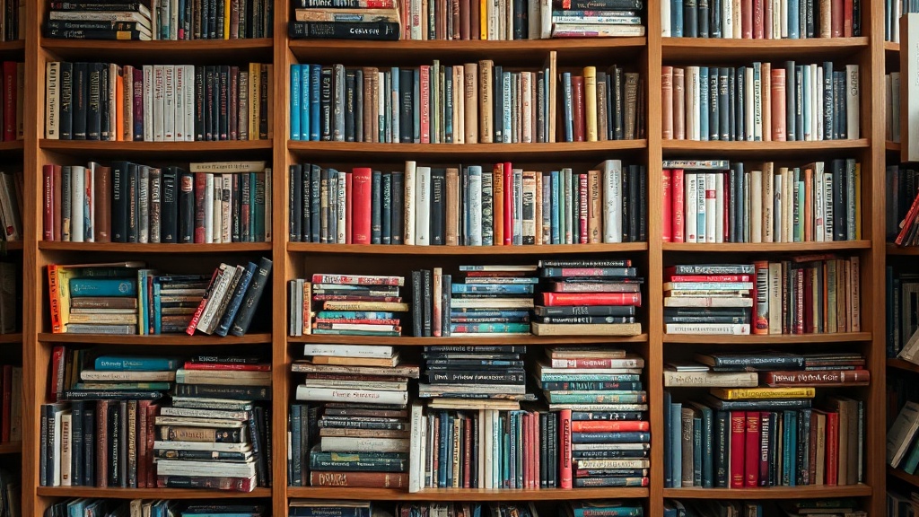
Bookshelves are where good intentions go to die. You start with a plan: display the books you love, add a few meaningful objects, maybe a plant or two. Six months later, it's a vertical junk drawer—receipts wedged between novels, that candle you never light, a photo frame facing the wrong direction, and three half-empty notebooks you forgot existed.
The problem isn't that you own too much stuff (though, let's be honest, that doesn't help). The real issue is that bookshelves lack natural boundaries. Unlike a coffee table—which has limited real estate—a bookshelf invites layering, stacking, and gradual accumulation. There's always "just one more spot" for something, and before you know it, every surface is occupied.
Architects call this "visual weight," and uneven distribution is what makes shelves feel off. When heavy objects cluster on one side, or when every single shelf is packed to capacity, your eye has nowhere to rest. The result is subconscious stress—you might not catalog why the room feels tense, but your brain registers the disorder.
How Much Empty Space Should You Actually Keep?
Here's the rule that will change everything: aim for 20-25% empty space per shelf. Not per bookshelf—per individual shelf. That breathing room is what separates a curated display from a storage unit.
This doesn't mean you need giant gaps. A small clearing between a stack of books and a ceramic vase counts. The point is to give each object its own territory. When items touch or overlap, they compete for attention. When they have space around them, they read as intentional choices.
Start by removing everything. Yes, everything. Lay it all out on a table or the floor and sort into categories: books, objects under 6 inches, objects over 6 inches, plants, and "maybe not." That last pile is critical—be honest about what you're actually displaying versus what you're just storing vertically.
Now rebuild one shelf at a time, working from the bottom up. Heavier, larger items anchor the lower shelves. Lighter, smaller pieces work better higher up where they won't feel precarious. Alternate between vertical book stacks and horizontal ones—this creates rhythm and breaks up the monotony of spines.
What's the Right Mix of Books to Objects?
The magic ratio is roughly 60% books to 40% objects, but that 40% includes negative space. So practically speaking, you're looking at about two-thirds books and one-third decorative items—vases, sculptures, boxes, framed photos, small plants.
But here's where personality comes in. A bibliophile might flip that ratio, and that's fine—as long as the books themselves become the visual interest. The trick is grouping them thoughtfully. Arrange by color for a more designed, tonal look. Arrange by size for something more organic and approachable. Or arrange by subject if you actually use your shelves for reference and want to find things.
Objects should vary in height, texture, and material. A glossy ceramic piece next to a matte wooden box creates contrast. A tall, slender vase paired with a low, wide bowl gives you vertical variation without competing scale. Avoid putting all your metallic items together—that's how you end up with the "thrift store display case" look.
And please, vary your depths. Not everything needs to hug the back edge of the shelf. Pull some books forward to create a ledge you can place something small in front of. Let a sculptural object sit slightly off-center. These small shifts in plane add dimension and keep the eye moving.
How Do You Deal With the "Leftover" Problem?
You edited. You curated. You have a pile of stuff that didn't make the cut. Now what?
First, be ruthless about the donate pile. That book you didn't finish three years ago? Someone else wants it. The vase you got as a gift and never liked? Regift or donate. Sentimental items are trickier—if you can't display them with pride, consider whether a box in the closet is really honoring that memory.
For the items you genuinely want to keep but can't fit, rotate them. Seasonal shelf styling isn't just for Instagram—it's a practical way to enjoy more of your possessions without overwhelming your space. Swap in that brass object in fall, the ceramic piece in spring. Your shelves stay fresh, and you actually use the things you own.
Storage boxes are your friend for the stuff that needs to stay accessible but doesn't deserve display real estate. Choose ones that complement your shelf color—wicker for warmth, lacquered boxes for polish, simple cardboard if you're going for that "library catalog" aesthetic. Just don't let the box itself become clutter.
What About Styling Around a TV or Functional Items?
Built-ins flanking a television present a special challenge—you're designing around a black rectangle that dominates the wall. The key is treating the TV as just another rectangle in your composition, not the center of the universe.
Flank it symmetrically for a formal, traditional feel. Asymmetrical arrangements feel more casual and modern. Either way, keep the shelves immediately next to the TV slightly lighter—less visual competition with the screen. Save your bolder objects for the outer columns where they have room to breathe.
Cables are the enemy of styled shelves. If you're dealing with a media console situation, use cable management systems to route wires behind the unit. For open shelving, consider where your outlets are before placing lamps or anything that needs plugging in. Nothing ruins a styled moment like a visible power strip.
Function-first shelves—like those in an office or kitchen—can still look composed. Use matching containers for supplies, keep work materials grouped by task, and embrace the container-within-container approach. A woven basket holding smaller boxes looks intentional; loose supplies scattered across a shelf just looks like you gave up.
Putting It Into Practice
Start with the shelf that bothers you most. Remove everything, clean the surface (dust loves neglected shelves), and rebuild using the 60/40 rule. Place your largest anchor item first—usually a stack of books or a substantial object. Build around it, alternating heights and textures. Step back every few minutes to assess. If your eye keeps landing on one spot, that spot is either your successful focal point or a visual speed bump that needs editing.
The goal isn't perfection—it's intention. A slightly imperfect shelf that looks lived-in beats a sterile, magazine-spread arrangement every time. The best bookshelves tell a story about the person who lives there. They just do it with better spacing.
"A bookshelf is as good a place as any to test whether you actually like the things you've acquired—or if you've just been holding on out of habit." — Designer Depot
For more on the psychology of spatial arrangement, Architectural Digest's guide to bookshelf styling offers excellent visual examples. If you're dealing with a particularly challenging built-in situation, Apartment Therapy's bookshelf styling tips cover awkward dimensions and rental-friendly solutions. And for a deeper dive into why visual clutter affects your stress levels, Verywell Mind explains the connection between environment and mental load.