Why Does Your Coffee Table Look Like a Random Junk Pile (and What's the Formula for Styling It)?

The Coffee Table Conspiracy Nobody Talks About
Most people think a coffee table is just a surface for remotes and coffee mugs—that its only job is to hold stuff within arm's reach. That's the misconception keeping your living room from looking pulled together. Your coffee table is actually the centerpiece of your seating area, the anchor that either elevates everything around it or drags the whole room down into visual chaos. And here's the uncomfortable truth: it's not about buying expensive objects. It's about understanding visual hierarchy, scale relationships, and the simple geometry of arrangement. You can style a $50 thrifted table to look magazine-worthy, or a $2,000 designer piece to look like a garage sale disaster. The difference isn't your budget—it's whether you know the rules that interior designers use to create those effortlessly styled tables you see in shelter magazines.
Why Does My Coffee Table Always Look Cluttered No Matter What I Do?
The clutter problem usually starts with good intentions. You add a candle. Then a coaster. Then a book. Then another book. Then a plant. Then suddenly you're staring at a surface that looks like a yard sale exploded. The issue isn't the individual items—it's the lack of visual organization.
Here's the fix: think in thirds. Divide your coffee table surface into three zones, either horizontally (left, center, right) or in a triangular arrangement. Each zone gets one primary object and possibly one supporting element. That's it. When you start treating the table as three distinct vignettes rather than one catch-all surface, the clutter magically disappears.
Scale matters more than you think. A tiny candle looks lost on a massive table; an oversized vase overwhelms a small one. The rule of thumb: your tallest object shouldn't exceed one-third the height of your sofa's seat height, and your largest horizontal object should take up no more than two-thirds of the table's width in any direction. These proportions create breathing room while still feeling intentional.
Texture stacking is where the magic happens. Combine hard and soft, shiny and matte, organic and geometric. A ceramic bowl (matte, organic) paired with a brass object (shiny, geometric) and a linen book (soft, matte) creates visual tension that keeps your eye moving. Without this contrast, everything flattens into visual monotony—even if the individual pieces are beautiful.
What's the Actual Formula for Coffee Table Styling?
Designers use variations of a simple formula that you can adapt to any shape or size table. It's not rigid—think of it as a framework that prevents the "pile of stuff" look.
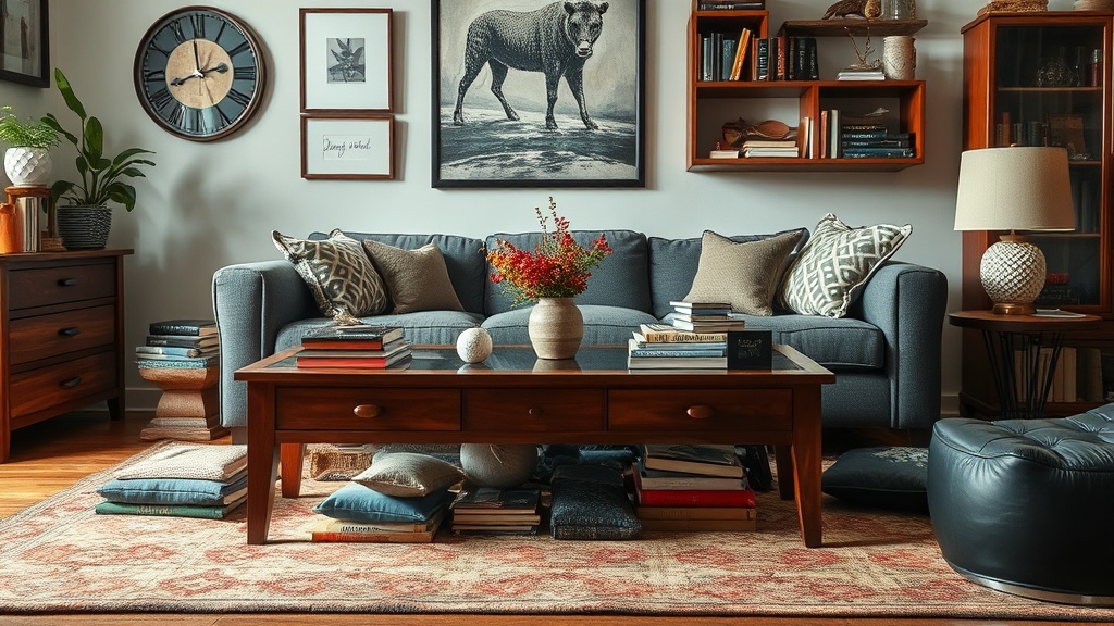
The foundational trio: every well-styled coffee table needs three things—a vertical element, a horizontal stack, and an organic shape. The vertical element draws the eye up and creates height (a vase, a sculpture, a tall candle). The horizontal stack grounds the arrangement and invites interaction (books, a tray, a box). The organic shape softens the geometry of the table itself (a plant, a coral piece, a rounded object).
Here's where most people go wrong: they skip one of these categories or double up on another. Two tall vases without anything horizontal looks like a hotel lobby. A stack of books with no vertical element looks like you just haven't put them away yet. The vertical-horizontal-organic trifecta covers all the visual bases.
Arrangement depends on your table shape. For rectangular tables, work in zones across the long axis—tall on one end, stack in the middle, organic on the other. For square tables, think triangular placement with the tallest piece slightly off-center. For round tables, create a central cluster with one dominant piece surrounded by supporting players. The key is asymmetry—perfect symmetry looks staged and lifeless. Offset that tall vase slightly. Let the book stack angle a bit. These small "imperfections" signal that a real human lives here.
The Numbers Game: Objects by Table Size
Small tables (under 36 inches): 3-4 objects maximum. One vertical, one stack, one organic—done. Medium tables (36-48 inches): 5-7 objects arranged in two zones. Large tables (48+ inches): 7-9 objects across three zones, or one large central arrangement with breathing room around it.
The corollary to this: if you're using a tray (and trays are excellent for corralling remotes and coasters), the tray counts as your horizontal element. Don't add a separate book stack unless your table is large enough to support two distinct horizontal moments.
How Do I Style a Coffee Table That Actually Functions for Real Life?
This is where Pinterest-perfect styling meets the reality of popcorn bowls and laptop perches. A beautiful coffee table that can't handle actual living is just a sculpture—impressive but useless.
The secret is the "reserve zone"—a deliberate empty space that accommodates life as it happens. On a rectangular table, keep one-third completely clear. On a square table, leave one quadrant open. On a round table, maintain a crescent of empty surface. This isn't wasted space; it's functional breathing room that prevents your carefully curated arrangement from becoming a nuisance.
For the practical stuff you actually need—remotes, coasters, maybe a box of tissues—use a lidded box or lidded basket as your horizontal element. Architectural Digest's styling guide recommends concealing the utilitarian inside something beautiful. A lacquered box or woven lidded basket reads as decor but functions as storage. The lid is crucial—seeing remote buttons breaks the visual spell you're trying to cast.
Consider the sight lines from your primary seating positions. That tall vase might look great from the entryway, but if it blocks the TV from the sofa or conversation sight lines from the armchair, it's in the wrong spot. Style for the people using the room, not for the camera angle.
What Common Coffee Table Mistakes Am I Making Without Realizing?
There are three subtle errors that separate amateur-looking tables from professional ones—and none of them cost money to fix.
Mistake one: the floating island. Objects placed dead-center on every surface look like they're trying too hard. Offset your arrangements by a few inches. Create negative space on one side. This asymmetry signals confidence and visual sophistication.
Mistake two: the height plateau. Everything at the same elevation reads as flat and boring. Even a two-inch difference between objects creates visual rhythm. Stack books to raise a smaller object. Use a pedestal or stand for something you want to highlight. Vary, vary, vary.
Mistake three: the catalog collection. When every object comes from the same store—or worse, the same collection—it looks like you bought a "table styling kit" rather than curating personal pieces. Mix vintage with new, high with low, handmade with manufactured. Your coffee table should look collected over time, not ordered in a single click. Apartment Therapy's comprehensive styling tips emphasize this curated-over-time approach that gives spaces soul.
The Refresh Cycle Nobody Mentions
Here's a professional secret: styled coffee tables have seasons. Not literal seasons (though you can do that too), but attention cycles. Rotate objects every few months. Move the books to the console table. Bring in that ceramic piece from the bedroom. This isn't frivolous—it's how you avoid visual fatigue and actually use the beautiful objects you've collected. A coffee table is a stage, and even the best cast needs rotation to stay interesting.
The best styled coffee tables tell a micro-story about the people who live there. They hint at interests, travels, curiosities—not in a heavy-handed "look at my personality" way, but in the casual accumulation of objects that mean something. A shell from a beach walk. A book about a passion project. A candle that smells like a favorite memory. The styling formula gets you to polished; the personal objects make it yours.
Remember that House Beautiful's design editors consistently emphasize restraint over abundance. It's always better to have three meaningful objects than eight forgettable ones. Edit ruthlessly. Step back and look. Remove one thing. That's usually the moment it clicks into place.
Your Coffee Table as Design Statement
The coffee table is where your living room's design philosophy becomes tangible. It's the intersection of form and function, beauty and utility, intention and accident. Get it right, and the whole room feels considered. Get it wrong, and even expensive furniture looks thrown together.
Start with the vertical-horizontal-organic formula. Arrange in thirds. Leave functional breathing room. Edit one object too many. And remember that the best coffee tables evolve—they're never truly "finished," just paused at a moment that happens to look really good right now.