Why Does Your Kitchen Island Look Like a Catch-All Instead of a Styled Moment?

Kitchen islands have become the de facto landing strip for every backpack, mail pile, and half-empty coffee mug in your home. They were supposed to be the crown jewel of your open-concept kitchen—the place where you'd roll out pastry dough while chatting with guests. Instead, yours looks like a staging area for a yard sale. This post breaks down why kitchen islands devolve into chaos (it is not your fault) and gives you the specific spatial rules and styling tricks that make them feel intentional, useful, and actually good to look at.
Why Does Functional Space Always End Up Looking Messy?
Here is the architectural truth: flat surfaces at waist height are magnets for human debris. It is anthropological—humans drop things at elbow level. Your island is probably 36 inches high, which happens to be exactly where your hands naturally rest when you are tired, carrying groceries, or herding children toward homework.
The problem is not that you are messy. The problem is that you have not created zones. Every successful kitchen island has three distinct territories: the prep zone (close to the sink or cooktop), the social zone (where stools go), and the display zone (the area that faces the entry or living room). Most islands fail because they try to be all three at once, everywhere, all over the surface.
Designers use a simple mental trick called "layered functionality." Think of your island like a theater stage—the back is for work, the middle is for transition, and the front is for the audience. When you separate these functions spatially, the clutter stops migrating. The mail does not belong in the prep zone any more than your cutting board belongs in the display zone. This sounds obvious, but look at your island right now—my bet is the colander and the car keys are having a party on the same square foot of countertop.
How Do You Style an Island Without Losing Workspace?
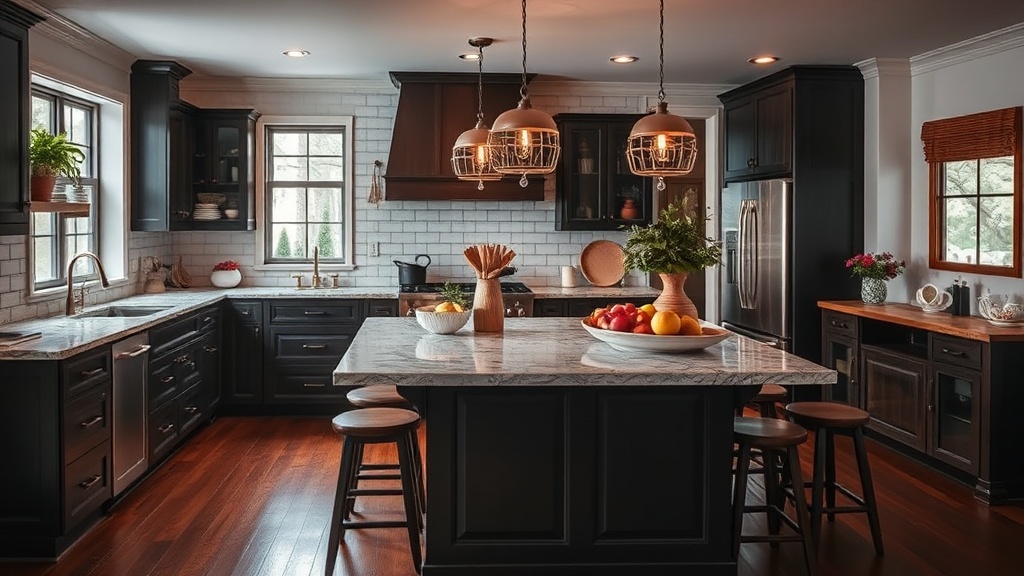
The biggest mistake people make is treating island styling like bookshelf styling—you do not have the luxury of empty space. This surface needs to earn its keep. The secret is vertical layering instead of horizontal spreading.
Buy a stack of cutting boards in varying wood tones and lean them against the backsplash (or the wall if your island has one). Suddenly you have height, texture, and actual utility taking up six inches of depth instead of eighteen. Add a ceramic bowl for fruit—real fruit, not plastic lemons—and you have a second layer. Top it with a small potted herb (rosemary is forgiving) and you have a third layer. Three heights, three textures, one compact footprint.
The rule designers follow is the "two-thirds rule": styled items should occupy no more than two-thirds of the visible surface from any main sight line. If you are standing in your living room looking at the kitchen, you should see styled moments on about 66% of the island, with the remaining third reading as breathing room or functional workspace. This ratio prevents the "museum gift shop" look where every inch is cluttered with tchotchkes, but it also prevents the "abandoned warehouse" look where one sad succulent looks lonely on six feet of quartz.
Trays are your secret weapon here—not the tiny silver things from wedding registries, but substantial rectangular or round trays that can corral actual daily debris. A 16-by-20-inch rattan tray can hold your olive oil, salt cellar, and pepper mill in the prep zone, and suddenly those utilitarian items look grouped instead of scattered. The tray signals intention. Architectural Digest's guide to island styling emphasizes this exact principle: containment reads as design.
What About the Space Underneath?
You have styled the top—now look lower. Most islands look top-heavy because the base is visually empty or, worse, visually chaotic with mismatched stools and chipped paint.
Stools need breathing room. The standard is 24 to 30 inches of width per stool, but the real magic number is knee space. You want 12 to 15 inches of overhang beyond the cabinet base so people can actually sit without doing the awkward knee-knock dance. If your overhang is shallow, your stools will always look crammed—and no amount of styling on top fixes that tension.
Lighting matters here too. Under-cabinet toe-kick lighting (cheap LED strips, easy install) grounds the island visually. It separates it from the floor plane and makes it feel like a piece of furniture rather than a floating box. Houzz's research on island seating shows that islands with defined lighting planes are perceived as "more finished" in blind surveys—even when respondents cannot identify why.
If you have open shelving on the island ends (popular in farmhouse and transitional styles), treat those shelves like curated bookcases. Stack bowls in one color family, alternate vertical and horizontal books, and leave 40% of the shelf empty. Open shelving is not storage—it is display that happens to hold useful things.
Why Do Some Islands Feel Like Furniture and Others Feel Like Afterthoughts?
The furniture-versus-afterthought question comes down to materiality. Islands that feel "designed" typically have at least three distinct material textures: the countertop (stone or wood), the base (painted or stained cabinetry), and a third accent element—perhaps metal legs, a waterfall edge, or a live-edge wood slab extension.
If your island is all one material (common in budget kitchens where the island matches every other cabinet), you need to introduce that third material through styling. A marble tray when the countertop is quartz. A brass fruit bowl when the hardware is nickel. These deliberate material contradictions signal that someone made choices here—this did not come from a builder's package.
Scale is the other half. Small items on large islands look ridiculous—like a postage stamp on a postcard. If your island is over seven feet long, you need substantial pieces. A oversized ceramic vase (even empty). A giant wooden dough bowl. A substantial butcher block that actually looks like it could hold an animal carcass (sorry, but it is true). Small items get lost; they create visual noise without presence.
Color also anchors. Most successful islands either match the room's accent color exactly or deliberately contrast it. The middle ground—"sort of coordinating but not really"—is where islands go to die. If your living room has cognac leather accents, your island should either have cognac leather stools or deliberately navy stools (the contrast color), not tan pleather that is trying to be cognac but missed.
Better Homes & Gardens' expert styling principles recommend this "commitment to contrast" approach for any transitional space—areas that bridge two rooms, which is exactly what most islands do.
How Do You Maintain the Look Without Becoming a Cleaning Fanatic?
Styling fails when it is too precious. If you have to move twelve objects to wipe the counter, you will stop wiping the counter. Good island styling includes "moveable foundations"—the cutting board stack can shift to the sink for cleaning, the tray can slide to the stove, the herb can visit the windowsill.
Establish a "reset time"—maybe 8 PM when the dishes are done—where the island gets restored to its photo-ready state. Five minutes. It is not about perfection; it is about resetting the baseline so tomorrow's clutter starts from a good place, not from yesterday's chaos.
And please—edit seasonally. That rosemary will die (it just will). The fruit bowl should actually have fruit, not three dusty oranges from February. The cutting boards will get grease-stained (rotate them). Treat island styling like a garden, not a monument. It is alive, it changes, and that is exactly what makes it feel like home rather than a showroom.