Why Does Your Living Room Feel Unbalanced and How Do You Fix It?

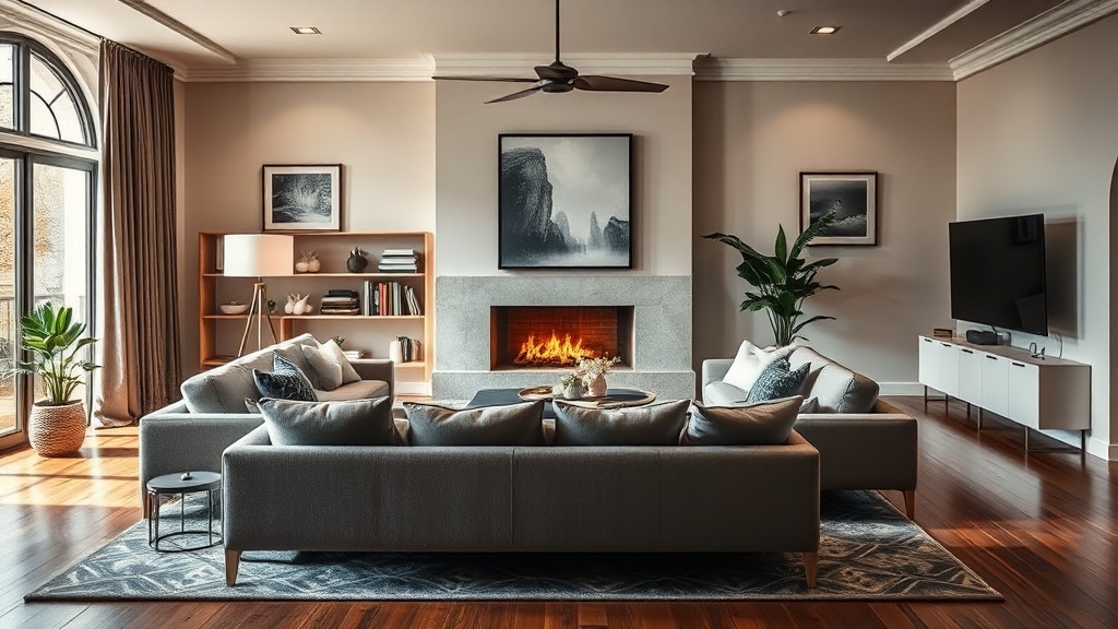
Why does a room that looks perfectly fine in a catalog feel totally off when you actually sit in it? You might have the right furniture and a decent color palette, but there is a nagging sense that something is tilted. It isn't just about empty space; it is about the weight of objects. In design, we talk about visual weight—the idea that certain items pull the eye more heavily than others. If you have a massive sectional on one side and a tiny, spindly side table on the other, your room is fighting a silent battle with gravity. This guide breaks down how to identify those imbalances and correct them without a total renovation.
Is Your Furniture Too Big or Too Small for the Room?
One of the most common mistakes I see (and one that even seasoned decorators slip up on) is a fundamental misunder1 of scale. People often buy furniture based on how it looks in a showroom rather than how it interacts with their specific floor plan. A sofa that looks grand in a massive studio might look like a toy in a sprawling great room. Conversely, a tiny armchair in a large room creates a "dead zone" that makes the space feel lonely and unfinished.
To avoid this, stop looking at the furniture in isolation. Instead, look at the volume of the space. A rule of thumb from the architectural world involves calculating the footprint of your largest pieces. If your sofa is a heavy, overstuffed velvet piece, it has high visual weight. To balance that, you need something with substance on the opposite side—perhaps a substantial media console or a heavy wooden coffee table. If you pair a heavy sofa with a glass-topped coffee table, that table might feel like it's "disappearing," leaving the room feeling top-heavy and uncomfortable.
Check your proportions against the ceiling height, too. A low-profile way to approach this is to ensure your furniture doesn't cut the room in half visually. If your sofa back is too high, it creates a wall that chops up the sightlines. If it is too low, the room might feel ungrounded. You want a rhythmic flow where the eye can move from the floor to the ceiling without hitting a visual roadblock.
How Do I Arrange Furniture for Better Flow?
Designers often talk about the "path of travel," which is just a fancy way of saying people need to be able to walk through a room without doing a side-step dance around a coffee table. If you find yourself constantly bumping into the edge of a rug or a chair, your arrangement is broken. A well-designed room respects the physics of human movement.
Consider these three fundamental layout rules:
- The Rule of Thirds: Don't center everything. If your coffee table is exactly in the middle of the rug, and your rug is exactly in the middle of the room, it can feel static and boring. Offsetting elements slightly creates a sense of movement.
- Clear Pathways: Leave at least 18 to 24 inches between your coffee table and your seating. This provides enough space for legs to move comfortably without feeling trapped.
- Negative Space: You need breathing room. If every corner is filled with a lamp, a plant, a basket, and a stack of books, the room will feel claustrophobic. Empty space—or negative space—is just as important as the objects themselves. It allows the eye to rest.
When planning your layout, I recommend using painter's tape on the floor to mark out the dimensions of your furniture before you actually move it. It's a low-stakes way to see if a piece is too bulky before you break your back moving it. For more technical advice on spatial planning and standard dimensions, you can consult the Architectural Digest archives for professional layout inspiration.
Why Do My Decor Pieces Feel Random and Disconnected?
This is where the "clutter vs. curation" battle happens. If your accessories feel like they were just tossed onto a surface, it's because they lack a cohesive thread. A room feels disconnected when there is no visual dialogue between the objects. A designer doesn't just place things; they create relationships between them.
To fix a disjointed room, look for a common denominator. This doesn't mean everything has to match—that's a recipe for a boring, sterile room. Instead, look for a shared characteristic. Perhaps it's a common metal finish, a similar silhouette, or a repeating color. If you have a collection of ceramic vases, try grouping them on a tray. The tray acts as a visual anchor, signaling to the brain that these items belong together as a single unit rather than three separate, random objects.
Another way to create connection is through height variation. A flat surface with five items of the same height looks amateur. A professional-looking surface uses a "triangle" approach: one tall item (a lamp or vase), one medium item (a candle), and one low item (a small bowl or book). This creates a sense of organized depth. If you want to see how professional designers handle grouping, the Elle Decor archives offer excellent visual-heavy examples of styled surfaces.
The Importance of Rug Sizing
Nothing kills a room's balance faster than a rug that is too small. A tiny rug acts like a postage stamp in the middle of an ocean; it makes the furniture look like it's floating in a void. To truly ground a seating area, at least the front legs of your primary seating pieces should rest on the rug. This ties the furniture together into a single, cohesive "island" of comfort. A larger rug provides a sense of stability and makes the room feel much more expansive than it actually is.
| Problem | Architectural Cause | Quick Fix |
|---|---|---|
| Room feels "choppy" | Too many small pieces | Use larger, statement pieces |
| Room feels empty | Lack of visual weight | Add heavy textures or large art |
| Furniture feels disconnected | Lack of height variation | Use the "Rule of Three" grouping |
| Pathways are blocked | Poor circulation planning | Clear 18-24 inch walkways |
Designing a space is less about buying the right things and more about understanding how those things interact with the light, the floor, and each other. It is a puzzle of weight, scale, and movement. Once you stop looking at objects as individual purchases and start seeing them as parts of a larger system, you'll find the balance you've been missing.