Why Your Gallery Wall Looks Unbalanced

Quick Tip
Start with your largest piece in the center or slightly off-center to establish a visual anchor.
The Myth of the Perfect Grid
Most people believe a gallery wall fails because the art itself is "wrong" or the frames don't match. In reality, an unbalanced gallery wall is almost always a structural failure of weight and visual center of gravity. You aren't struggling with bad taste; you are struggling with physics. If your wall feels "heavy" on one side or looks like a chaotic explosion of frames, you haven't failed at decorating—you've simply ignored the visual weight of your objects.
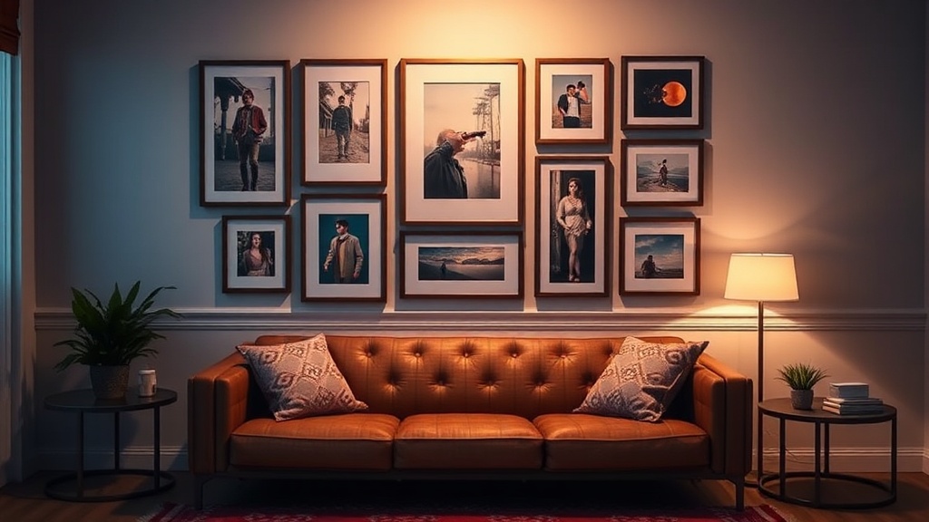
Identify the Visual Anchor
Every successful arrangement needs an anchor. This is usually your largest or most visually dense piece. Instead of starting from the top corner and working your way down—which creates a "cascading" effect that feels unstable—start with your heaviest piece slightly off-center. If you are hanging art above a mid-century modern sideboard or a linen-upholstered sofa, the anchor should sit at eye level, roughly 57 to 60 inches from the floor. Without this anchor, your smaller frames will look like they are drifting away from the wall.
The Problem with Uniform Spacing
A common mistake is trying to force a perfect, mathematical gap between every single frame. While a strict grid works for a formal dining room, a curated gallery wall needs "breathable" tension. If you use a standard 2-inch gap for every piece, the wall can look sterile and rigid. Instead, aim for a consistent spacing range—between 2 and 3 inches—but allow for variation in frame depth and texture. Mixing a thin, black metal frame with a thick, ornate wood frame adds much-needed architectural interest. If you find the arrangement feels cluttered, you might be experiencing the same issues found in messy bookshelf styling, where too many small objects compete for attention.
Balance Weight, Not Just Size
Balance is not just about the physical dimensions of the frames; it is about the "visual weight" of the content. A small, bright neon print carries more visual weight than a large, muted charcoal sketch. To fix an unbalanced wall, use these three steps:
- Lay it out on the floor: Before a single nail touches the wall, lay your frames out on the floor in front of the intended space.
- Check the center of gravity: Move pieces around until the "heaviness" feels distributed. If you have a dark, heavy frame on the left, counter it with two or three lighter, smaller frames on the right.
- Test the sightlines: Stand back and squint. If one area of the wall jumps out at you aggressively, you need to redistribute the color or density to that area.
Remember, a gallery wall is an exercise in composition, not just a collection of pictures. Treat it like a blueprint rather than a collage.