Why Your Entryway Console Table Looks Lonely

The anatomy of a functional and visually balanced entryway
This guide explains why your entryway console table likely feels disconnected from the rest of your room and provides a structural framework to fix it using scale, height, and layering. You will learn how to move beyond basic decoration to create a vignette that serves both a functional purpose for your daily routine and an aesthetic purpose for your home's first impression. We will break down the specific ratios of height and volume required to stop a console from looking like a lonely piece of furniture floating against a wall.
In architectural terms, an entryway is a transition zone. It is the threshold between the chaos of the outside world and the controlled environment of your home. When a console table looks "lonely," it is usually because it lacks a visual anchor. It is failing to bridge the gap between the floor and the ceiling, or between the wall and the walkway. To fix this, you must stop thinking about "decorating" and start thinking about "composition."
The rule of three heights
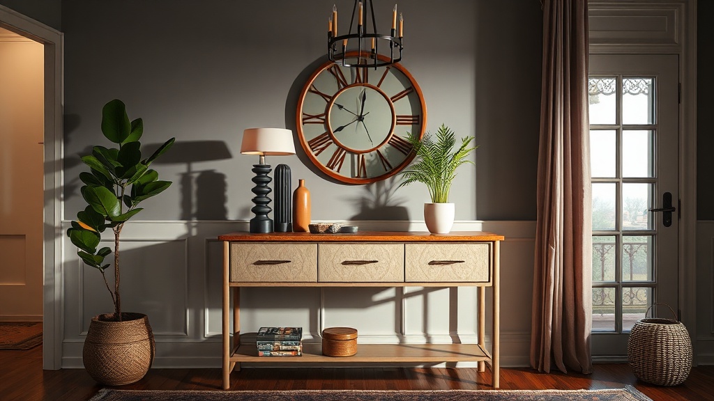
The most common mistake in console styling is a lack of verticality. If every object on your table is roughly the same height—such as a stack of books, a small tray, and a candle—the eye perceives a flat, stagnant line. To create a professional look, you need to implement the rule of three heights: low, medium, and high.
- Low elements: These are your foundational pieces. Think of a shallow marble tray for keys, a stack of two hardback coffee table books, or a small sculptural bowl. These items ground the arrangement and provide a base for other objects.
- Medium elements: These bridge the gap. A medium-sized ceramic vase with dried eucalyptus or a stack of three books provides the necessary transition.
- High elements: This is your vertical anchor. This is typically a tall lamp, a large piece of art leaning against the wall, or a structural branch in a vessel. Without a high element, your console will always look unfinished.
If you find your table looks sparse, you are likely missing that high-point anchor. A lamp is the most effective tool here because it provides both height and much-needed task lighting. If your lamp feels too small, you are likely experiencing the same issue discussed in our guide on why your bedside lamps are too low, where the scale of the light source fails to command the space it occupies.
Addressing the vertical void
A console table is a horizontal plane, but it exists beneath a large vertical surface: the wall. If you place a table against a bare wall, the table will always look disconnected because there is a massive "void" above it. You must treat the wall and the table as a single integrated unit rather than two separate entities.
There are three primary ways to bridge this vertical gap:
- The Mirror Method: A large, oversized mirror is the most efficient way to add scale. A mirror reflects light and creates the illusion of depth, making a narrow hallway feel wider. Ensure the mirror is at least 2/3 the width of the console to maintain proper proportions.
- The Art Lean: If you prefer a more relaxed, organic look, lean a large-scale piece of framed art against the wall. This adds a sense of weight and prevents the "floating" sensation.
- The Sconces Approach: For a more permanent, architectural solution, install a pair of wall sconces. This adds permanent vertical interest and provides a sophisticated layer of light that doesn't rely on a tabletop base.
The physics of scale and proportion
Scale is not just about how big an object is, but how it relates to the objects around it. A common error is "cluttering" the table with many small, insignificant items. This creates visual noise rather than a curated look. Instead of five small trinkets, choose one large sculptural piece and one medium-sized functional item.
Consider the "weight" of your objects. A heavy, dark wood console paired with a delicate, thin-wire lamp will look unbalanced. If your console is a heavy piece of mid-century teak, pair it with substantial objects like a thick ceramic vessel or a heavy stone tray. If your console is a light, airy metal frame, use glass or translucent objects to maintain that sense of lightness.
"Design is not about adding more; it is about the strategic placement of weight to create equilibrium."
Functional layering: The "Landing Strip" concept
An entryway is a high-traffic zone. It needs to be functional. A console that is purely decorative but has no place for your keys or mail is a failed design. However, a console that is purely a catch-all for mail and loose change is a mess. The solution is the "Landing Strip" technique: creating designated zones for utility within your aesthetic composition.
To do this effectively, use containers. A leather valet tray can hold your keys and sunglasses, keeping them contained and preventing them from looking like clutter. A sculptural basket underneath the console can hold umbrellas or seasonal scarves. By using containers, you are "hiding" the chaos while "displaying" the organization.
Common mistakes to avoid
As you begin to rearrange your space, watch out for these three specific pitfalls that strip a room of its professional polish:
- The "Line of Sight" Error: Do not place objects that are too tall in the center of the table if they block the view of the art or mirror behind them. Place your tallest item to one side to create an asymmetrical, more dynamic silhouette.
- The Symmetry Trap: While symmetry is safe, it can also be boring. A perfectly symmetrical setup (lamp on left, lamp on right, bowl in middle) can feel stiff and institutional. Try an asymmetrical approach: one tall lamp on the left, a medium vase on the right, and a low tray in the center.
- The "Too Much Air" Problem: If your console is 60 inches wide and you only have one 12-inch candle on it, the table will look abandoned. You must fill the horizontal length with enough visual weight to make the table feel "anchored" to the floor.
A checklist for your next styling session
Before you clear your table and start over, run through this checklist to identify exactly what your console is missing:
- Do I have a vertical anchor? (Mirror, art, or a tall lamp)
- Do I have three distinct heights? (Low, medium, and high)
- Is there a functional container? (A tray, bowl, or basket for daily items)
- Is the scale appropriate for the wall? (The art/mirror is large enough to command the space)
- Is the lighting layered? (You have a light source that isn't just the overhead ceiling light)
By applying these architectural principles of scale, height, and weight, you move away from the "influencer" style of simply placing pretty things on a surface. You are instead building a composed vignette that works with the physics of your room. A well-styled console table doesn't just look good in a photograph; it provides a sense of order and intentionality the moment you walk through your front door.