Building a Color Palette That Flows Between Every Room

You walk from your entryway into the kitchen, then through the dining room, and finally into the living area, only to feel a jarring sense of "visual whiplash" at every doorway. One room is a moody sage, the next is a stark, clinical white, and the third is a warm terracotta. This lack of cohesion isn't a failure of your furniture choices; it's a failure of your color logic. A flowing color palette uses a shared DNA of tones to ensure that even as rooms change character, they still feel like they belong to the same house.
We're going to look at the structural math behind color transitions. I'll show you how to select a core palette that works across different light exposures and how to use "bridge" colors to prevent your home from looking like a disjointed collection of unrelated showrooms.
How Do I Pick a Consistent Color Palette?
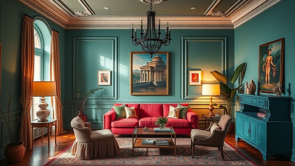
A consistent color palette is built on a foundation of a single "anchor" color or a specific undertone that repeats throughout the home. Instead of picking colors at random, you pick a primary neutral and then select varying saturations of that same family. If your living room has a deep navy sofa, your bedroom might feature a light, dusty blue in the drapery. The relationship isn't about using the exact same paint code in every room—that's a rookie mistake—but about maintaining the same temperature (cool vs. warm) and the same level of gray or yellow in your neutrals.
Think of it like a musical key. A song can change tempo and volume, but if it stays in the same key, it doesn't sound like a mess. In design, your "key" is your base color. If you love cool tones, don't suddenly pivot to a warm, buttery yellow in the kitchen unless you have a very intentional transition plan.
Here is a breakdown of the three main ways to structure your palette:
- Monochromatic Variation: Using different shades, tints, and tones of one single color (e.g., light gray, charcoal, and slate).
- Analogous Harmony: Choosing colors that sit next to each other on the color wheel (e.g., blue, blue-green, and green) to create a soft, natural transition.
- The 60-30-10 Rule: A structural ratio where 60% is your dominant color (usually walls/large surfaces), 30% is your secondary color (upholstery/rugs), and 10% is your accent (decor/art).
If you're struggling with how to make a room feel "finished" once the colors are on the wall, you might want to check out my guide on why your living room feels unfinished. Color is only one piece of the puzzle.
What Are the Best Neutral Colors for an Entire House?
The best neutrals for an entire house are "chameleon" colors—shades that have enough pigment to look intentional but enough gray or beige to adapt to changing light conditions. When you move from a north-facing room (which has cool, bluish light) to a south-facing room (which has warm, golden light), a paint color can look completely different. A white that looks creamy in the kitchen might look like a cold, hospital gray in the hallway.
I always recommend testing samples from high-quality manufacturers like Sherwin-Williams or Benjamin Moore because their pigment density is much more predictable than budget brands. You want to look for "greige" or "warm whites" rather than pure, stark white. Pure white can feel clinical and unforfeiting in a residential setting. A soft, off-white with a hint of ochre or a very light sand tone provides a way more forgiving backdrop for your furniture and art.
To decide which neutral works for your specific layout, use this comparison table:
| Neutral Type | Best For... | The Vibe | Potential Pitfall |
|---|---|---|---|
| Warm White | Living/Dining Rooms | Inviting, cozy, soft | Can look "yellowed" in low light |
| Cool Gray | Modern/Minimalist Spaces | Crisp, professional, clean | Can feel "flat" or uninviting |
| Greige (Warm Gray) | High-traffic hallways/Open plans | Sophisticated, balanced | Hard to find the "perfect" balance |
| Muted Sage/Earth | Bedrooms/Reading Nooks | Calming, organic, grounded | Can feel heavy if the room is small |
Don't forget that your lighting is part of the color. If you have a lot of overhead lighting, your colors will shift. If you're using layered lighting, you'll notice the color of your walls change as you turn on different lamps. This is why I always tell my students to buy a sample pot, not just a tiny swatch. Paint a large piece of poster board and move it around the room at different times of the day.
How Do I Transition Between Different Room Colors?
Transitions happen through "bridge colors"—elements that contain bits of both the room you are leaving and the room you are entering. If your hallway is a light beige and your living room is a deep forest green, you need a middle ground. This could be a rug in the hallway that has a tiny speck of green in its pattern, or a piece of art in the entryway that features the green from the living room. This creates a visual "breadcrumb trail" for the eye to follow.
A common mistake is trying to force a hard line between rooms. You don't need a doorway that looks like a border. Instead, use architectural elements to soften the blow. A transition can be a change in floor material, a change in ceiling height, or even a change in the "weight" of the color. You might go from a light, airy color in the entryway to a much heavier, more saturated version of that same color in the study.
Here are three ways to execute a smooth transition:
- The Gradient Method: Use the same color family but change the saturation. A pale blue in the bathroom can transition to a mid-tone blue in the bedroom, and a navy in the primary suite. It feels like a natural progression of depth.
- The Material Bridge: If your colors are changing, keep your materials consistent. If you have consistent wood flooring throughout the house, the eye will accept a wider variety of wall colors because the "ground" remains the same.
- The Accent Repetition: Take a color from a "destination room" and pull it into a "transit room." If your dining room has navy velvet chairs, put a navy blue vase in the hallway leading to it. It prepares the brain for what's coming next.
It's worth noting that you don't have to be afraid of color. I see people get paralyzed by the idea of "clashing." Most clashes are actually just a lack of intention. If you choose a color because it's a slightly different shade of the same hue, it's not a mistake—it's a design choice. (Even if you're just doing it because you liked a paint sample on a whim, call it "tonal layering" and move on.)
When you're working with textures, remember that color and texture are siblings. A flat, matte paint color in a small room can feel heavy, while a satin or eggshell finish can add a bit of light bounce. If you're adding a cozy nook to your home, consider how the color will interact with your textiles. A deep, saturated color works beautifully when paired with high-texture fabrics like wool or linen. If you're interested in how to build those spaces, see my post on layering textures for cozy nooks.
The goal isn't to make every room look identical. If every room in your house is the same shade of "Swiss Coffee" white, you haven't designed a home; you've designed a gallery—and a boring one at that. Use your palette to give each room a distinct personality while keeping the underlying logic consistent. That's how you build a house that actually feels like a cohesive home.