Curating a Gallery Wall Without the Chaos

A client once showed me a collection of framed sketches, a vintage brass mirror, and three small landscape paintings that she had spent months collecting. The problem wasn't the art; it was the execution. When she finally hung them, the pieces looked like they were fleeing the wall in different directions. The result wasn't a curated gallery—it was a visual accident. This post breaks down the structural logic of a gallery wall, moving past the "vibes" to explain how to manage scale, spacing, and weight so your collection looks intentional rather than accidental.
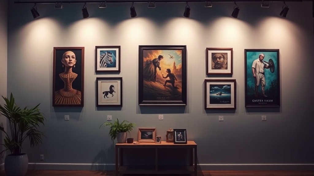
How Do You Choose the Right Layout for a Gallery Wall?
The best layout depends entirely on the shape of your wall and the visual weight of your pieces. You’ll want to decide on a structural "anchor" before you touch a single nail. A common mistake is treating every frame as an equal unit, but in a well-designed space, one or two larger pieces should act as the foundation for the smaller ones.
There are three primary-styles you can use to organize your art:
- The Grid: This is the most disciplined approach. It uses identical frames and uniform spacing to create a sense of order. It works best for high-end, minimalist aesthetics where the art is secondary to the pattern.
- The Salon Style: This is the "organized chaos" look. It involves mixing different frame sizes and even different mediums (like a wooden plate next to a canvas). It’s more forgiving but requires a central focal point to keep it from looking messy.
- The Linear Arrangement: This works well above a console table or a sofa. You align the centers of the pieces along a single horizontal axis. It’s a cleaner, more modern way to display art without the overwhelming feeling of a full-wall installation.
If you’re working in a tight space, remember that your arrangement should complement your furniture. If you’re hanging art above a mid-century modern sideboard, the width of the gallery wall should generally be about two-thirds to three-quarters of the furniture's width. If the art is wider than the furniture, the room will feel top-heavy and unbalanced. If you find your furniture feels disconnected from your walls, read our guide on the anatomy of a living room to understand how scale affects your layout.
Before you hammer anything, lay your art out on the floor. It sounds tedious, but it saves you from the "oops, I need a bigger hammer" moment. Move pieces around until the grouping feels balanced—not necessarily symmetrical, but balanced in terms of visual density.
How Much Space Should Be Between Frames?
Standard spacing for a gallery wall is typically between two and three inches, depending on the size of the pieces. Consistency is your best friend here. If one gap is an inch and the next is four, the human eye perceives it as a mistake rather than a design choice.
The "gap" is essentially the negative space that allows the eye to breathe. If your frames are too close, the wall looks cluttered and cramped. If they are too far apart, the collection loses its cohesion and looks like a group of unrelated objects. Think of it like a sentence—the words (your art) need enough space to be legible, but the spacing (the white space) is what holds the thought together.
Pro-tip: Use a spacer. Take a small piece of wood or even a thick piece of cardboard cut to exactly 2.5 inches. Use that physical object to ensure every single gap in your arrangement is identical. It’s a low-tech way to achieve a high-end look.
| Arrangement Type | Ideal Spacing | Visual Vibe |
|---|---|---|
| Formal Grid | 1" - 2" | Strict, orderly, architectural |
| Eclectic Salon | 2" - 4" | Lived-in, organic, maximalist |
| Linear/Horizontal | 3" - 5" | Calm, expansive, modern |
What Are the Best Materials for a High-Low Gallery Wall?
A great gallery wall doesn't require a trip to a high-end auction house. In fact, mixing "high" and "low" elements is what gives a room character. You can combine a high-quality, heavy-weighted frame from a place like Anthropologie with thrifted, vintage finds that have actual history. The goal is to create texture through variety.
When mixing materials, watch your "visual weight." A heavy, dark wood frame carries more weight than a thin, white metal frame. If you have a lot of heavy pieces, you’ll need more "light" pieces to balance them out, or the wall will feel like it’s leaning toward the floor. (I’ve seen too many people hang heavy, dark frames at the top of a wall, which creates a crushing sensation in a small room.)
Consider these combinations to add depth:
- Texture: Mix a flat canvas with a textured textile piece or a 3D object, like a small brass sculpture or a ceramic plate.
- Medium: Combine photography (black and white works well for cohesion) with oil paintings or sketches.
- Frame Styles: A mix of gold leaf, matte black, and natural wood provides a sense of time and place.
Don't forget about the glass. If you're hanging art in a room with lots of natural light, be aware of glare. Using non-reflective glass or acrylic can prevent your art from becoming a mirror for the rest of the room. If you're working with a tight budget, you can often find high-quality frames at places like IKEA, but be sure to swap out the cheap plastic components for something with more substance if the piece is a focal point.
One thing to keep in mind is the height of the center point. A common mistake is hanging the arrangement too high. The center of your gallery wall (the "heart" of the cluster) should be at eye level—roughly 57 to 60 inches from the floor. If it's too high, the art feels disconnected from the furniture below it. This is a common issue when people try to fill large vertical voids, but it often results in a room that feels disjointed. If you're struggling with how to fill large wall spaces without making the room feel smaller, check out our post on using mirrors to expand visual space.
The most important thing is to trust the process. It’s easy to get frustrated when the first three pieces you hang look "off." That's because you're looking at the parts, not the whole. Step back. Go into another room. Come back ten minutes later. The wall should look like a single, cohesive unit, not a collection of individual items. If it doesn't, you probably haven't found your anchor piece yet. Go back to the floor, re-group, and try again.