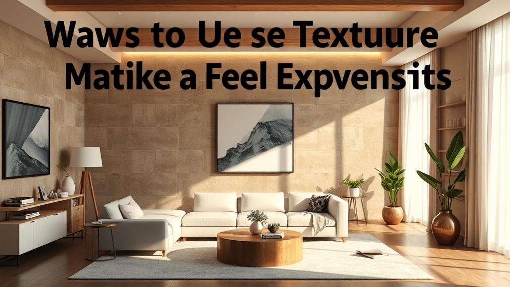
Ways to Use Texture to Make a Flat Room Feel Expensive

A room with monochromatic walls, a standard grey sofa, and a flat laminate coffee table often suffers from a lack of visual depth. This "flatness" occurs when every surface reflects light in the exact same way, leaving the eye with nothing to latch onto. To fix this without a full renovation, you must introduce texture. Texture is the physical or visual "tooth" of a material—the roughness of a linen, the sheen of silk, or the grain of raw wood. By layering different tactile qualities, you create shadows and highlights that give a room architectural weight and a high-end, curated feel.
The Difference Between Visual and Tactile Texture
Before you start shopping, it is essential to understand that texture operates on two levels: tactile (what you feel) and visual (what you see). A room that relies solely on tactile texture—like a chunky knit throw—can feel heavy or cluttered if the visual patterns are too busy. Conversely, a room with only visual texture—like a wallpaper with a faux-linen pattern—can feel "thin" or artificial because there is no physical depth to catch the light.
High-end design succeeds by balancing both. An architect looks at a room as a series of planes. If your walls are smooth drywall, your floor might be a matte hardwood, and your furniture is upholstered in a tight weave, the room will feel sterile. To break this up, you need to introduce "disruptors"—materials that interrupt the smoothness of the space.
Layering Textiles to Add Depth to Seating
The sofa is usually the largest visual anchor in a living room. If you have a standard, smooth-fabric sofa, it often looks like a giant, flat block of color. You can solve this by treating the sofa as a foundation for layering rather than a finished piece.
- Mix Weight Classes: Do not use three pillows of the same fabric. Instead, pair a heavy, structured velvet pillow with a lightweight, crushed linen pillow. The velvet absorbs light, creating deep shadows in its folds, while the linen reflects a softer, more diffused light.
- Introduce Raw Edges: A standard cotton pillow looks mass-produced. Look for textiles with frayed edges, heavy bouclé weaves, or exposed seams. The irregularity of a bouclé fabric—characterized by its looped, knotted yarn—adds an organic, expensive-looking grit to a smooth room.
- The Rule of Three Materials: For a professional look, aim for three distinct textures on one seating surface. A common winning combination is: one smooth (leather or high-sheen silk), one matte (linen or cotton), and one heavy/tactile (wool or sheepskin).
If you find that your furniture feels a bit dated or lacks character, you might consider reviving your vintage furniture with non-toxic chalk paint to add a matte, chalky texture that feels more intentional and artisanal than a high-gloss factory finish.
Architectural Texture via Wall Treatments
Walls are often the most overlooked surface in a budget-friendly design. Most people default to flat latex paint, which provides zero architectural interest. To make a room feel "expensive," you need to move away from the perfectly flat plane.
Limewash and Roman Clay
Limewash is a highly effective way to add movement to a wall without the permanence of a heavy wood panel. Unlike standard paint, which sits on top of the surface, limewash reacts with the substrate to create a soft, mottled, suede-like finish. It creates a "living" wall that changes appearance based on the time of day and the angle of the light. This is a great way to add a sense of history to a modern apartment.
Wall Molding and Trim
If you want to add physical depth, look toward traditional millwork. Even simple picture frame molding can create a play of light and shadow on a wall. This adds a sense of structural integrity to the room, making it feel like the walls were built with intention rather than just being partitions. If you are working with a small space, adding subtle molding can also create a sense of verticality, much like how you can make a small kitchen feel much larger through structural illusions.
Using Natural Elements to Ground a Space
Synthetic materials often look "flat" because they lack the organic imperfections found in nature. To elevate a room, incorporate materials that have a visible grain, pore, or irregularity. This is where "expensive" design often differentiates itself from "fast furniture" design.
Stone and Mineral: A marble coffee table with heavy veining provides visual texture that a laminate table cannot. Even if you cannot afford a full marble slab, incorporating smaller elements like a travertine tray or a soapstone candle holder adds a sense of weight and permanence to a room.
Wood Grains: Avoid overly uniform, "perfect" wood finishes. Instead, look for woods with prominent grain patterns, such as walnut or reclaimed oak. The tactile sensation of a wire-brushed wood surface provides a much-needed contrast to the smooth surfaces of glass, metal, or polished stone.
Organic Greenery: Plants are a form of living texture. A smooth-leaved plant like a Fiddle Leaf Fig provides a different visual weight than a highly textured plant like a Fern or a Dracaena. Use the varied leaf shapes to break up the hard lines of your shelving or cabinetry.
The Role of Lighting in Highlighting Texture
Texture is invisible without proper light. You can spend thousands on high-quality materials, but if you use a single, harsh overhead light, those textures will be washed out. To make a room feel expensive, you must use light to create shadows.
Avoid the "Big Light": The single, bright light in the center of a room flattens everything. It fills in all the shadows, making your velvet pillows look like flat fabric and your textured walls look like flat paint. Instead, use a layered lighting approach. Use floor lamps, table lamps, and sconces to create "pools" of light.
Directional Lighting: If you have a textured wall or a piece of sculptural art, aim a light source toward it. This creates "grazing" light, which catches the ridges of the texture and casts small shadows, emphasizing the depth of the surface. This technique is common in high-end galleries and can be easily replicated at home with a well-placed spotlight or a directed task lamp.
Common Mistakes to Avoid
While texture is a powerful tool, it is easy to overdo it. A room filled with too many competing textures becomes chaotic rather than curated. Follow these guidelines to keep your design sophisticated:
- Avoid "Texture Overload": If you have a highly textured rug (like a high-pile shag), keep your sofa fabric relatively smooth. If you have a heavily patterned wallpaper, keep your window treatments simple and solid.
- Watch the Color Saturation: Texture can sometimes make a color look darker or more intense. A bright red in a smooth silk will look very different than the same red in a chunky wool. Always test your textures in the actual light of the room.
- Don't Forget the Ceiling: If your walls and floors are heavily textured, a flat white ceiling can feel like a "lid" on the room. Consider a subtle ceiling texture or a soft, matte paint finish to complete the envelope of the space.
Designing a space that feels expensive isn't about how much you spend; it's about how much thought you put into the interaction between light and surface. By moving away from flat, uniform materials and embracing the grit, grain, and weave of the world, you create a home that feels architecturally sound and visually rich.